-
I want to thank all the members that have upgraded your accounts. I truly appreciate your support of the site monetarily. Supporting the site keeps this site up and running as a lot of work daily goes on behind the scenes. Click to Support Signs101 ...
You are using an out of date browser. It may not display this or other websites correctly.
You should upgrade or use an alternative browser.
You should upgrade or use an alternative browser.
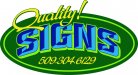
Quality Signs Logo
- Thread starter qualitysign
- Start date
Jillbeans
New Member
I can't enlarge it but from what I can see, it has a script on a curve, which I have been told is not the right thing to do.
And when using a prismatic lettering, always consider your light source.
Yours appears to be coming from underneath the lettering, which to me is a bit odd.
I would switch out the colors and make the dark one lighter or the light one darker, more subtle.
I think you put the yellow outline onto the prismatic to make it pop but the entire logo lacks contrast to me.
Putting the lettering on the oval is OK but it may have been better if all the lettering fit inside the oval. (like for embroidery purposes etc)
And I usually don't put the phone number in the logo.
Hey you asked.
Welcome to 101 and my comments are meant to be helpful not hurtful.
Love.....Jill
PS
This next comment is not directed at you but merely an observation.
I was out in traffic the other day and noticed a new 4'x8' sign. You could not read the logo at all. It was a bunch of various green things on a light yellow background. Really weak roman style lettering on the name, about 1.5" high. The service (Landscaping) was about 2" high, same weak thin font. Lettering color was baby poop brown.
But the phone number, honest to God, was the entire length of the bottom of the sign and at least a foot high, really squished, in black.
")
And when using a prismatic lettering, always consider your light source.
Yours appears to be coming from underneath the lettering, which to me is a bit odd.
I would switch out the colors and make the dark one lighter or the light one darker, more subtle.
I think you put the yellow outline onto the prismatic to make it pop but the entire logo lacks contrast to me.
Putting the lettering on the oval is OK but it may have been better if all the lettering fit inside the oval. (like for embroidery purposes etc)
And I usually don't put the phone number in the logo.
Hey you asked.
Welcome to 101 and my comments are meant to be helpful not hurtful.
Love.....Jill
PS
This next comment is not directed at you but merely an observation.
I was out in traffic the other day and noticed a new 4'x8' sign. You could not read the logo at all. It was a bunch of various green things on a light yellow background. Really weak roman style lettering on the name, about 1.5" high. The service (Landscaping) was about 2" high, same weak thin font. Lettering color was baby poop brown.
But the phone number, honest to God, was the entire length of the bottom of the sign and at least a foot high, really squished, in black.
neato
New Member
The layout itself isn't bad at all. A couple things....
1. A phone number should never be a part of a logo.
2. The script font for the phone number isn't working.
3. The logo doesn't pass the squint test. You're color choices aren't contrasting enough. Try putting a white outline around the word signs to make it pop off the background, or better yet, lighten the word 'Signs' drastically to give some contrast.
4. It seems like the 'S' on the right side is distorted. It's a little distracting. It seems more squished than the left 'S'.
As far as the script on a curve thing, I agree with Jill 99.99% of the time, but not on that point. I think in general you have to be careful with it as it can go sour if it's overdone. But I think you did a great job of fitting the script to this curve. It's not distracting at all and gives the word some 'bounce'.
I hope I'm not overstepping my bounds here, since you didn't ask for a critique. It really isn't a bad layout, just needs some tweaks
Mosh
New Member
•Script in an arc (Big NO NO, beginner's design mistake)
•poor colors (hard to read)
•10,000 places called quailty signs (one is 45 miles from me here in nebraska)
•Like the oval
Are you new to making signs? The design looks like it is from someone who just got them one
of those "sticker cutters" and is now a sign making shop.
•poor colors (hard to read)
•10,000 places called quailty signs (one is 45 miles from me here in nebraska)
•Like the oval
Are you new to making signs? The design looks like it is from someone who just got them one
of those "sticker cutters" and is now a sign making shop.
Last edited:
Flame
New Member
* take off phone number
* oval is way overdone
* name is even more overdone
* prism lettering... wrong light source, poor colors, no real impact
* script on an arch, no bueno
* horrible colors. They don't flow together, it's really hard to read.
No offense, but you'd probably be better off to start from scratch, try some fresh ideas and see where they take you.
Marlene
New Member
all of the above plus I can't see it larger, please make sure your file is an RGB as that is more than likely the reason for the red X.
your name is what it is but it needs a logo to back up that name. when you give yourself a lofty name like "Quality" the logo needs to support that image and I don't think beveled letters on an arc on an oval does that. If I was a potential customer and saw your name, I would expect the logo to reflect that and when it doesn't, I wouldn't call. not being mean, just giving you something to think about as it is hard to design for yourself and what seems so clear to others is often missed.
your name is what it is but it needs a logo to back up that name. when you give yourself a lofty name like "Quality" the logo needs to support that image and I don't think beveled letters on an arc on an oval does that. If I was a potential customer and saw your name, I would expect the logo to reflect that and when it doesn't, I wouldn't call. not being mean, just giving you something to think about as it is hard to design for yourself and what seems so clear to others is often missed.
bob
It's better to have two hands than one glove.
Script on an arc? Generally copy in script is not done in an arc but one notable exception to this is a casual descriptor or superlative. Often but not necessarily a single word. Words like 'Special', 'Quality', 'Contact', 'Available', 'Coming Soon', etc are often done as a splash on a curve. This is one of those rare times where sign writing can depart from traditional typographical guidelines and get away with it.
In this specific case 'Quality' can be properly rendered on a curve. The rest of the thing is amateurish dreck but that element isn't at fault.
In this specific case 'Quality' can be properly rendered on a curve. The rest of the thing is amateurish dreck but that element isn't at fault.
neato
New Member
Again, script on an arch can work just fine if it's not overdone. Personally, I think it adds a nice bounce to the word. Here's just a few of the many examples of it used, although not all of these are great.
Take a look at food packaging next time your in a grocery store. It's done all the time and can look very nice.
Caution is needed though. It can look very funky very fast if you overdo it...
Take a look at food packaging next time your in a grocery store. It's done all the time and can look very nice.
Caution is needed though. It can look very funky very fast if you overdo it...
Attachments

Craig Sjoquist
New Member
Welcome to a outstanding forum and people
the layout is not bad .. but can improve
I would try ..remove phone 1st....then increase the size of .. signs & quality so they both go outside the oval a bit
color contrast is poor
the layout is not bad .. but can improve
I would try ..remove phone 1st....then increase the size of .. signs & quality so they both go outside the oval a bit
color contrast is poor
signmeup
New Member
Dude..... what are you on? Next the square will be passe along with the circle....and rectangles?! Wayyyyy overdone!* take off phone number
* oval is way overdone
* name is even more overdone
* prism lettering... wrong light source, poor colors, no real impact
* script on an arch, no bueno
* horrible colors. They don't flow together, it's really hard to read.
No offense, but you'd probably be better off to start from scratch, try some fresh ideas and see where they take you.
:ROFLMAO:Flame
New Member
Dude..... what are you on? Next the square will be passe along with the circle....and rectangles?! Wayyyyy overdone!
You know HOW MANY CONTRACTORS here have an oval with a pinstripe around it? That exact oval he has shown there, portrays like 25% of ALL my customers. I am so, so so sick of the oval with a pinstripe. Just like the swoosh being over done in some parts, for me, it's the oval with a stripe. Give me a freaking circle and I'll be happy, just them durn ovals..... lol.
signmeup
New Member
Common now......fess up..... you've been drinking.You know, that's a good point. In fact, I think the letter 'T' is way overdone too. In fac, I'm no gonna use i anymore. I's sooooo yeserday.
Rick
Certified Enneadecagon Designer
Triangles!!??....don't get me started.....
Have you tried the oval rotated 90 degrees?
I've been rotating mine 180°