-
I want to thank all the members that have upgraded your accounts. I truly appreciate your support of the site monetarily. Supporting the site keeps this site up and running as a lot of work daily goes on behind the scenes. Click to Support Signs101 ...
You are using an out of date browser. It may not display this or other websites correctly.
You should upgrade or use an alternative browser.
You should upgrade or use an alternative browser.
Recent Projections I did
- Thread starter Locals Find!
- Start date


Flame
New Member
Dude you're like a glutton for punishment. Pic #2 graphic looks horrid and placement is far too high. Pic #3 shows horrid placement of text and that bird head, seriously, wth went down with that one? Pic #4 isn't HORRID, but really not that pretty and could use some tweakings with the text, more breathing room, and I wouldn't have chosen those fonts, that's for sure.
Craig Sjoquist
New Member
You sure are making your signs look alot better, good going, looks like ya ya put good solid effort on each one.
Sure do hope to see more thanks.
Sure do hope to see more thanks.
AUTO-FX
New Member
Projections or projects?!
Uh-oh.
Bathtub design looks pretty good.
A little crooked, but otherwise I think it's good.
Good idea, putting it up high, in case your client wants to add some copy later.
(you were thinking that, right?)
Pat Whatley
New Member
Awesome work! Thanks for sharing.
Locals Find!
New Member
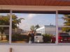
Bathtub is high because of hedgerow blocking the view from the street.. Looks crooked due to my bad camera work from my phone.
SlightlyChilled
New Member
Not much to say but I would like to ask;
Why did you push that bathtub graphic up so close to the top of the window frame?
Seems out of place. Was it to allow people inside to see out under it?
wayne k
guam usa
He found a ladder
Still looks a little off
Attachments
J
john1
Guest
Damn they come down hard on your Addie, It's good seeing members get work.
Keep your head up, You can only learn from job to job and improve for the next job.
Keep your head up, You can only learn from job to job and improve for the next job.
CheapVehicleWrap
New Member
Uh-oh.
Bathtub design looks pretty good.
A little crooked, but otherwise I think it's good.
Good idea, putting it up high, in case your client wants to add some copy later.
(you were thinking that, right?)
Chris, no doubt this was done for drainage.
Locals Find!
New Member
He found a ladder
Still looks a little off
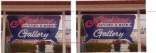
I know it looks crooked in the picture its not. I measured it 8 times from the top of the window and on 3 points down on each one we put up.
I was paranoid about it being straight. Where I was standing taking the picture was not level in anyway giving the picture the crooked look.
Locals Find!
New Member
Addie,
you should have centered the graphic - gone back to the parking lot with a herbicide
and fixed that hedge for them.
wayne k
guam usa
LOL the thought did cross my mind. However, the leasing office was right next door and I don't think they wouldn't have noticed the only white guy in the neighborhood lugging around herbicide.
Locals Find!
New Member
Glad you used the font I suggested on the Bathtub one! (LHF Advertisers Plug ATK)
That font worked out great. I actually tried to go buy it and couldn't find it. I used the portion of it you sent me.
If you can help me find a working link to it I would love to have it in my collection for another project.
Also, have to give a shout out to signfonts.com they hooked me up with the American portion of the design. Going back this week to buy the font he used.
CheapVehicleWrap
New Member
I know it looks crooked in the picture its not. I measured it 8 times from the top of the window and on 3 points down on each one we put up.
I was paranoid about it being straight. Where I was standing taking the picture was not level in anyway giving the picture the crooked look.
Are you 100% certain. I think it's crooked. Any way of getting a 3rd party to verify your claims?
Locals Find!
New Member
Are you 100% certain. I think it's crooked. Any way of getting a 3rd party to verify your claims?
Yeah, the Big guy in the picture with me. He did the majority of the work. He is a member here. Have to track him down and find his screen name on here.
Edit: Found out his screen name here its Tone_S he will verify it went on straight he measured quite a bit too.