• I want to thank all the members that have upgraded your accounts. I truly appreciate your support of the site monetarily. Supporting the site keeps this site up and running as a lot of work daily goes on behind the scenes. Click to Support Signs101 ...

Retro HVAC logo and Ribbon Script Effect

Dan Antonelli

New Member
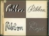
Nice looking pencil script , but you should go back to the drawing board for an authentic ribbon script

I didn't mean to imply I was trying to replicate an exact ribbon script. I was definitely inspired by them, no doubt, but the true ribbon script style suffers from legibility issues which I think would make it tough to read in an outdoor realm. So I did my own interpretation of it, with a modern twist to make up for the original style's poor legibiity.

I'm sorry if that didn't live up to a traditional definition of an authentic ribbon script, but in my book, and the clients, it does what it was intended to do.
 

Service Sign Co

New Member
I didn't mean to sound harsh with my criticism of your script, just implying that it looks more like a pencil script than a ribbon script, legibility is really not an issue with either style
 

visual800

Active Member
One thing that stands out on old logos is the use of the oddest shapes I have ever seen, such as the one you have created. Stuff back them was clean and precise. More people need to get back to that and quit using 6 fonts on one design, start adding elemts and pics to our layouts.

Love the layout and respect the retro designs
 

ucmj22

New Member
I have to assume the fabric texture in the red is vector. What process was used for that? Gradient mesh?


Edit: when I looked at it on your twitter feed this morning, it looked like the background had a crosshatch texture, but now it appears to be horizontal lines.

Nice work to you and your team.
 
Last edited:

tsgstl

New Member
Wow stunning

My biggest problem is fear of spending to much time in a direction that I'm not sure the customer will like. Granted your staff is far more talented and faster than I but is this the version you proposed to the client? Or was it a rough sketch of this?

Side note: if it wasn't you and the designer was explaining the textures and effects, most likely the idea would of been poo pood on this forum.
 

Dan Antonelli

New Member
Wow stunning

My biggest problem is fear of spending to much time in a direction that I'm not sure the customer will like. Granted your staff is far more talented and faster than I but is this the version you proposed to the client? Or was it a rough sketch of this?

Side note: if it wasn't you and the designer was explaining the textures and effects, most likely the idea would of been poo pood on this forum.

Client hired us specifically for retro, so we know going in that's the direction, and our Creative Brief document also helps in terms of specific genre within retro that they want. We go over the briefing document at length before sketching to make sure what they say in the brief makes sense, or if I feel it needs to go in another direction. But this is what we presented. We loosely pencil sketched and colored quick in PS. I knew the ribbon would look stunning on a van, and since we'd already been contracted for the wrap design, I did a very quick mockup of what I had in mind. Unfortunately this design isn't going to work on a Transit, so we're pushed into the panel shape. The client also had to change the name slightly.

We do mainly pencil sketches for everything, and then you need a client to give you that trust that it will be awesome when fully rendered. Sketching saves time, obviously. Budget for this logo was 18 hours. We probably went slightly over.

The initial wrap idea would have been pretty cool.
 

Attachments

  • nelson_air_1-1.jpg
    nelson_air_1-1.jpg
    47.7 KB · Views: 86

Dan Antonelli

New Member
I have to assume the fabric texture in the red is vector. What process was used for that? Gradient mesh?


Edit: when I looked at it on your twitter feed this morning, it looked like the background had a crosshatch texture, but now it appears to be horizontal lines.

Nice work to you and your team.

Just simple vector rules to get the texture.
 

rjpjr

New Member
I have been studying a lot of 1930-1950s typography books and one style fascinated me - the ribbon scripts used. Finally had an opportunity to pull one off here. Jeff, my illustrator took the idea and ran with it. We're doing the wrap design next which should be cool.

But this one is definitely one of my favorites as of late.

Nicely executed:thumb: Thanks for sharing with us. I personally look forward to your posts as I find them inspirational.
 

Rick

Certified Enneadecagon Designer
I know this is weird, but when I first opened the page, and seen the logo it made me think of Maytag.. :p

Yeah, weird, since it's not even close.... (add little toungey thingy to not take me serious)

Dan,

When I first saw this logo, I started rummaging through my books looking for the lettering reference that had a ribbon typeface. I use references all the time as inspiration, they are usually flawed and need reinterpretation. I practically had to tear the house apart to find the ribbon reference since I have hundreds of old design books from the 1910's to the 80's... I finally found it... anyway, that would make a cool dimensional sign and I think the ribbon type screams of "service" in this application and that is usually what stylized retro is all about. Many logos are too sterile, many are too literal, retro speaks to most people as "service" oriented.

One noticeable thing about 50's logos, quite a few were trying to be retro of the 20's and 30's...

The book image below is from 1942
 

Attachments

  • ribbon type ref-small.jpg
    ribbon type ref-small.jpg
    421.2 KB · Views: 85
Last edited:

Joe Diaz

New Member
Great design Dan. I love ribbon scripts. I made one for the first time last year for a party supply store. I was really proud of how it turned out but the client didn't like and instead went with her "idea". Well apparently she made a habit out of ignoring advice of other craftsman and professionals, because a few months later she was closing her shop. I still use the design in my portfolio though. I hope the design gods smile down on this layout so it sees the light of day and makes your client loads of money.
 

Dan Antonelli

New Member
Yeah, weird, since it's not even close.... (add little toungey thingy to not take me serious)

Dan,

When I first saw this logo, I started rummaging through my books looking for the lettering reference that had a ribbon typeface. I use references all the time as inspiration, they are usually flawed and need reinterpretation. I practically had to tear the house apart to find the ribbon reference since I have hundreds of old design books from the 1910's to the 80's... I finally found it... anyway, that would make a cool dimensional sign and I think the ribbon type screams of "service" in this application and that is usually what stylized retro is all about. Many logos are too sterile, many are too literal, retro speaks to most people as "service" oriented.

One noticeable thing about 50's logos, quite a few were trying to be retro of the 20's and 30's...

The book image below is from 1942

Rick, the top left image is one I had seen - I think in the Scripts book from Amazon. It obviously would have legibility issues, which is why we modified it. Some one earlier in the thread mentioned ribbon scripts do not have legibility issues, but I had disagreed, as the few referenced where black on dark side and white on other side, and I think it would be impossible to get that to work in most outdoor instances.

That's very interesting that you mention the 50's logos were trying to replicate designs of the 20s. You may have just blown my mind because I never thought of that.

Joe - I think I remember the logo for that party store. I can't believe they didn't use it. Fortunately, this is a done deal and approved. On to the truck wrap next!
 

CustomEyes Design

New Member
The effect is nice Dan.
When you do something like this and present it to the customer do you lay out why you did it this way on the main lettering?
I mean by association I'd link a ribbon to some type of clothing/sewing/craft or maybe something aimed at women in general and not so much HVAC.
From your posts I know you don't do things just because they look good.

INteresting question. In all the lettering examples, the ribbon effect wasn't slanted towards anything specific to do with sewing/craft/etc - so I hadn't really even thought there was a connection to it. However, women do represent a large part of the usual demographics for HVAC guys on initial point of contacts (then the husbands get involved subsequently on the details). So maybe it was a happy accident? :)

FWIW, when I saw the OP my mind went right to air, wind, blowing... There are always mylar ribbons on display fans and AC units. Like their name just flows from the units they work on...
 

longlivemedia

New Member
The logo is really great. You have chosen quite a relevant typography that does not capture too much attention but is very much fit for the logo.
 

ThinkRight

New Member
Dan Antonelli
The Sign Master made SignCraft May/June issue !
Could not find the link though.
It came in snail mail today
Maybe someone can find the link.
 
J

john1

Guest
I don't think there is anything i have seen of Dan's that didn't blow me away.
 

Dan Antonelli

New Member
Dan Antonelli
The Sign Master made SignCraft May/June issue !
Could not find the link though.
It came in snail mail today
Maybe someone can find the link.

Thanks!

Which link were you looking for....? I have a PDF of the article I have to post on our site- is that what you mean?

Haha SignMaster... Friday I spent a good part of the day cleaning up the office and taking out the trash, fighting with health insurance agents, workers comp morons, and my dopey payroll company.
 
Top