• I want to thank all the members that have upgraded your accounts. I truly appreciate your support of the site monetarily. Supporting the site keeps this site up and running as a lot of work daily goes on behind the scenes. Click to Support Signs101 ...

Rough logo ideas for catering company.

Jillbeans

New Member
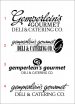
Established business for over 30 years.
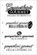
Third owner, a chef, hates name and image.
(see first pic)
Wants to gear more towards the wedding catering crowd.
This part of his business has really taken off.
He hates the old image of this place, the name is kind of hokey.
Their initial logo used a pig and Brush Script
(my idea for the 2nd owner circa 1990)
*He wants to use his lonnnng last name
*no chef or silverware icons
*likes initials (hence the PS and GG)
*must incorporate deli because he is keeping this portion of the business
Any critique, comments welcome.
#3 is where I was headed.
Nothing is kerned or anything yet.
:thankyou::signs101:
Love....Jill
 

Attachments

  • banner.jpg
    banner.jpg
    119.4 KB · Views: 117
  • gg.jpg
    gg.jpg
    58.2 KB · Views: 110

TyrantDesigner

Art! Hot and fresh.
I like #2 the most, but the deli and catering is a lot heavier and STRONGER than your script above it. probably go with something a little softer on the bottom and i think that is a sender. like the oval with the G breaking out of it. others have potential ... 1 is pretty standard, I would just make sure the weight of 'gourmet' and 'deli and catering' look the same (probably have to add a hair line of thickness around the deli and catering to get that look.) ... 3 i'm not digging the "GG" in the circle above ... looks like an after thought. and 4 ... not liking the typeface.


oh and your kerning is off.:thumb:
 

Pat Whatley

New Member
....and to add confusion to it I like #1. I'd either shrink "GOURMET" or extend the descender in the
"p" so that they bottom of the p and the bottom of GOURMET were even.
 

Jillbeans

New Member
Are these any better?
I really appreciate the comments.
The only one I didn't mess with was #3.
 

Attachments

  • gg2.jpg
    gg2.jpg
    62.2 KB · Views: 136

Vinylman

New Member
Jill:

I liked #1 from the outset.

IF it would be possible without over extending the word "gourmet" would it help the layout to slide the word right so all three lines align flush left?
 

Jillbeans

New Member
Like this?
I hear you about the Papyrus and Scriptina!
I think it may be getting too complicated for embroidery use though.
 

Attachments

  • gg3.jpg
    gg3.jpg
    64.4 KB · Views: 112

WildWestDesigns

Active Member
I think it may be getting too complicated for embroidery use though.

Script and thin with quite a bit of copy are never a good combo with embroidery.

Sometimes you can muddle through it and get it close, but you really have to work at it.

I wouldn't do a stroke at all around text that you think might be used for a logo crest on embroidery. It's hard to get someone to take something away if that was in their logo. Print is a different world then embroidery.

#1 might be doable. Gemperlein's might be a tricky, but with the right height, doable without the stroke. Due to the type of text, a stroke in embroidery would be on the verge of needing to be a running stitch and while that is an outline stitch, I just never think it looks good. A small satin outline would be tricky with the script font though. Deli and Catering would be a micro font ready for embroidery. Might find one close, but they will just have to take what they get. That small and that thin would cause some issue with thread being "absorbed" into the fabric.

#2 and #4 I don't see any of those happening. Script much to thin and close together.

#3 has the best potential for converting to embroidery. That Deli and Catering is still a little on the thin side though. I, however, really not "feeling" that one. I like #1 the best, but a little on the tricky side for converting into embroidery, but #2 and #4, I don't see happening.
 

Border

New Member
I like #1 in post # 6 but think it might look good with Deli & Catering in a reverse panel or banner of some sort...?
 

Border

New Member
Or how about tying in Catering with the bottom of the G. I realize everything is off here, bad font choice, kerning, welding/merging and angles but just to give a [very] quick idea. -you said they wanted to focus more on Catering now, I think.
Gotta run to a meeting!
 

Attachments

  • s101.jpg
    s101.jpg
    44.6 KB · Views: 109

Jillbeans

New Member
OK changed the top two.
(thanks for the emailed suggestion for #2)
I'm trying to make it more embroidery friendly as I know he's getting shirts and aprons.
#2 I think is where I'd like to keep it but I still want to display at least two suggestions to the guy.
:thankyou:
 

Attachments

  • gg4.jpg
    gg4.jpg
    59.2 KB · Views: 112

Locals Find!

New Member
I like #1 in post #9 but, I am no designer and you probably don't care about my opinion. However, I really really like it.

You do nice work Jill! Just had to give you the compliment you well deserve.
 

WildWestDesigns

Active Member
I'm trying to make it more embroidery friendly as I know he's getting shirts and aprons.

#1 is still tricky but for different reasons then the previous #1.

#2 and #3 have the best chance for conversion. Out of those two, I agree with you on #2.

#4 is going to be a nightmare. Particularly if for those shirts he get's are picque fabric. Thin and compact script is just going to be "swallowed up" by the fabric unless the embroiderer really stabilizes it. Aprons would depend on the quality, some are more stable then others.

"Deli and Catering" would more then likely need to be a micro font for embroidery on all of them. It would just depend, but they are pretty thin as well and that polo fabric really does like to "eat up" thin stitching.
 

WildWestDesigns

Active Member
Evan which font do you suggest for deli & catering company?
Thanks.


Strictly for embroidery at that size, I usually go with Wilcom's Small Block font.

It's not fun, it's not artistic, it's flat out production friendly. It's going to be very hard for you to find a TT font, that will also work with embroidery at that size. Unless you go with the fonts that people that design in Word and Powerpoint love to use.

I do have a suggestion for something, but I will PM that to you and I'll go into a little more detail.
 

Jillbeans

New Member
OK so this is where we are so far.
He likes the top and bottom, his wife likes the middle.
I like the Oil Can font
(said in the tin man's voice)
from the tattoo logo I'm working on so I tried it with GOURMET.
 

Attachments

  • gemp.jpg
    gemp.jpg
    115.8 KB · Views: 105
Top