-
I want to thank all the members that have upgraded your accounts. I truly appreciate your support of the site monetarily. Supporting the site keeps this site up and running as a lot of work daily goes on behind the scenes. Click to Support Signs101 ...
You are using an out of date browser. It may not display this or other websites correctly.
You should upgrade or use an alternative browser.
You should upgrade or use an alternative browser.
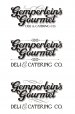
Rough logo ideas for catering company.
- Thread starter Jillbeans
- Start date
Craig Sjoquist
New Member
Well I liked the script in #1
But as you tried different layouts, the only thing nice was the script in the one word not 2.
# 3 was the most consistent in liking on a long term then came the new #3 in last post #20 and yes better then the old #3
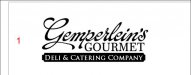
That is my vote #3 in post #20 ...professional looking
But as you tried different layouts, the only thing nice was the script in the one word not 2.
# 3 was the most consistent in liking on a long term then came the new #3 in last post #20 and yes better then the old #3
That is my vote #3 in post #20 ...professional looking
Lunatic Taskbar
New Member
I like #3 Jill. Easiest to read.
Started playing around and got carried away.
What about stacking the two words of the business name so they can carry the same weight without making the logo to long?
Looks good! Could probably be used both ways depending on what it is being used for!

")
Service Sign Co
New Member

stickerman12
New Member
In your first post what about using the font for Gimperlien's in #1 with Gourmet in the reverse panel.
zmatalucci
New Member

WildWestDesigns
Active Member
What about something like this?
He agrees with what we say about the simple/legible.
But this may be fancy enough to please his wife?
Based on Neato's suggestion.
That's going to be fun.
Gino
Premium Subscriber
This is gonna sound dumb, but personally, I don't like it because of the combination of letters in his name. His name just doesn't look good like that. No flow. It appears mumbly-jumbly to me. too many curves and up-sweeps messing with the overall appearance.
I think it needs to be more solid and substantial looking to do him/his business any justice.
That being said, now look at this awful piece we're doing later today. The guy came in and told me what he wanted. I typed it in and started checking out type styles and he said I want something really crazy, so I put this up for chits and giggles and he said... go no further, that's it. I said c'mon, you're kiddin' me, right. He gave me $600 in advance on Wednesday and we're doing it today. I knew there was no changing his mind and it wasn't worth it, since he gave me the $600, so in my opinion, the guy has no class so why fiddle around with his kinda mentality ??
Sometimes............. you just know when to quit.
Attachments

Gino
Premium Subscriber
Oh my.
Yeah, Larry burned his eyes a little while weeding it............. Kasey threw up and Jeremy just won't waste any time even looking at it.
This week was the week from He!!. I think we've done more ugly signs this week than ever before in a 5 day period..... probably a 2 year period.

SignManiac
New Member
The guys name sucks...Gonna be hard to find any font that will read easily with a name like that!