-
I want to thank all the members that have upgraded your accounts. I truly appreciate your support of the site monetarily. Supporting the site keeps this site up and running as a lot of work daily goes on behind the scenes. Click to Support Signs101 ...
You are using an out of date browser. It may not display this or other websites correctly.
You should upgrade or use an alternative browser.
You should upgrade or use an alternative browser.
School project.
- Thread starter routierracing
- Start date
mikey-Oh
New Member
not bad for a class assignment... keep plugging away and push the design skills while you're there. anything's possible with carte blanche and i suggest you unleash.
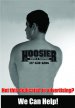
concerning the ad, feel like the copperplate conflicts with the logo lettering. also the ellipse is lost against the white background.
concerning the ad, feel like the copperplate conflicts with the logo lettering. also the ellipse is lost against the white background.
speedmedia
New Member
I like the concept, strognly dislike the fonts used.... It will come with time.
Thanks,
Kurt
Thanks,
Kurt
routierracing
New Member
font
do you guys have any other font suggestions?
do you guys have any other font suggestions?
SignManiac
New Member
Too busy. It lacks any layout at all. Just lettering stuck on top of a photo. I don't think you need the logo on their twice. just the tattoo is enough and text is all too big.
routierracing
New Member
So then any constructive advice on the direct to move forward with it? Part of the assignment was for it to be a photoshop project with vector illustrator elements.
Pat Whatley
New Member
I would have used a different company logo for the tattoo.
routierracing
New Member
Thanks! Ill try mocking one up with a generic company for the tattoo.
SignManiac
New Member
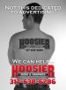
This is how I would approach it. More minimal. Keep the message together instead of filling up the entire photo, plus it's less distracting from the image.
The company name being the tattoo, all the information is there and since its a tattoo, the viewer is going to focus on reading that anyway.
The company name being the tattoo, all the information is there and since its a tattoo, the viewer is going to focus on reading that anyway.