-
I want to thank all the members that have upgraded your accounts. I truly appreciate your support of the site monetarily. Supporting the site keeps this site up and running as a lot of work daily goes on behind the scenes. Click to Support Signs101 ...
You are using an out of date browser. It may not display this or other websites correctly.
You should upgrade or use an alternative browser.
You should upgrade or use an alternative browser.
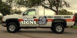
Shop Truck Wrap
- Thread starter OlsonSigns601
- Start date
Pat Whatley
New Member
Can you actually have advice without criticism?
signcrafters london
New Member
If this were my truck, and I were going with this theme, The only thing that would really make sense to me is to lose the logo you have on there now, and substitute it with an alternate version of your logo that looks like authentic nose art. Perhaps you could use some period accurate scripts. Maybe even a sexy pinup. I would lose the diamond plate and make it look as though the graphics were painted on. Using a bit of transparency to your lettering and graphics, and allowing the panels and rivets to show through, will give it the illusion that the graphics were painted on.
Not sure If that would help your brand as a whole, but I'm unsure how this airplane look helps your brand. My thought is if you going to commit to that look, do it all the way and do it right. Google search nose art for some ideas and put your own twist on it.
+1. Joe nailed it.
rjssigns
Active Member
Themed to look like the Warbird X275 drag car. Which is mega-kewl.
http://www.yellowbullet.com/forum/showthread.php?t=473488
Yes I'm a racer. It's the only way I would know about this car.
And I agree with Joe. You got the foundation now do the branding with a "nose art" inspired theme. There are lots of resources including cd's and dvd's with the proper graphics to build 'nose art".
Jillbeans
New Member
Joe beat me to it. I think a pinup would look great.
You could also blow up the bulldog pic real big and use that.
As for the diamond plate, doing it in gold seems extra tacky.
The font used for your city/state is very unprofessional looking. As has been said, use the same as for Captain Tom.
Also, doing it in white makes it virtually invisible.
I would darken the red stripe to a maroon and change the white stars to navy.
As for your logo itself, it really lacks pizazz.
I'd make "OLSON" in caps and lower case, and make sure the outlines on Olson and SIGNS are the same thickness.
You don't need a texture on everything. You have it on the background, in the stripe, the name, and even in the city/state.
Just because you can doesn't mean you should.
If every element is highlighted, nothing stands out.
Love....Jill
quicksigns
New Member
There is nothing original about this airplane look. It's been done so many time, my son even have a hot wheel mustang with the same look with the shark mouth in front. And diamond plate too? Are you getting all this template from Aroura Graphic CD? Arizona wraps had a scion that was wrap to look like a tank back in the day that was tight.
HulkSmash
New Member
There is nothing original about this airplane look. It's been done so many time, my son even have a hot wheel mustang with the same look with the shark mouth in front. And diamond plate too? Are you getting all this template from Aroura Graphic CD? Arizona wraps had a scion that was wrap to look like a tank back in the day that was tight.
Arizona Color
Rick
Certified Enneadecagon Designer
your logo is weak, it does not go well with the theme of the wrap. Like cdiesel mentions, it should incorporate into the wrap.
Joe brings up a great point, if you are going to do it, do it all the way with period correct type, imagery...
umm, why is the star upside down?
Joe brings up a great point, if you are going to do it, do it all the way with period correct type, imagery...
umm, why is the star upside down?
SignManiac
New Member
putting the star on upside down makes it original.
OlsonSigns601
New Member
Didn't mean to put the star upside down... Anyway nobody likes the Diamond Plate but me I guess so it goes. Turns out we're going 180 on this and going to go with the original "Captain America" theme just like the Van to make them similar in design.
Also, the AirPlane Skin might be widely used, but in this area I've only seen it used once.
As for the logo: Its been part of our company now for 3 years. Its easy to read, simple and easy to duplicate on either one color or two color designs.
Jill Beans and others thanks for the feedback. Pat, if I wasn't interested in any ones feedback, I wouldn't have posted and I wouldn't be changing it.
I'll be creating a "Captain America" theme and posting for thoughts. Thanks Everyone.

Rick
Certified Enneadecagon Designer
Jillbeans
New Member
As for the logo: Its been part of our company now for 3 years. Its easy to read, simple and easy to duplicate on either one color or two color designs.

weaselboogie
New Member
I know its a little late.. Looks good to me, but what do I know im an unknown newbie.. yeah I might not prefer your company logo styling for myself.. but besides that... I look at the full truck pic and like it.
who cares if people in the sign business thing the airforce jet theme has been done too many times... Ive never seen a wrapped vehicle with it, if I saw this truck locally, id think "looks good" and you can see the lettering on the bed good from a distance, so one would know its a sign company
who cares if people in the sign business thing the airforce jet theme has been done too many times... Ive never seen a wrapped vehicle with it, if I saw this truck locally, id think "looks good" and you can see the lettering on the bed good from a distance, so one would know its a sign company