• I want to thank all the members that have upgraded your accounts. I truly appreciate your support of the site monetarily. Supporting the site keeps this site up and running as a lot of work daily goes on behind the scenes. Click to Support Signs101 ...

Sign for Massage Therapist, critique please

Jillbeans

New Member
I just had to put a tree on a hair salon sign, and it went against everything I ever knew (along with everything else on the sign including the fonts)
I tried to steer the client into something more appropriate but in the end I just let her have what she wanted and I will never show the photos to anyone.
She, however, was near-orgasmic about the sign.
I could see a tree as sort of somehow seeming to indicate relaxation but it would have to be just a suggestion of one or maybe a leaf or something.
 

Blackie

New Member
Always work off customer's request- incorporate the tree

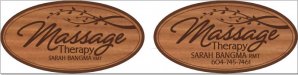
Here's a few versions of a sign for an RMT who works out of her house and wants to be sure her clients know they're at the right home. She is in a busy neighborhood, so I figured it is worth having her phone # so potential clients have a way of contacting her.

My preference would be to do the top left one as a sandblasted cedar sign with a nice routered edge so I can play with some new equipment. I'm not 100% happy with the fonts though and was thinking it would look good in A&S Old Glory for "Massage Therapy" but I don't want to buy the font if the design sucks or she doesn't like it. (I'm just starting out so my font budget is verrry limited right now)

The bottom left was inspired by a design on the A&S site, but I don't think it's her style at all so that one's more a design exercise for me I guess.

The ones on the right are based off her requests, and again I'd love to use better fonts like A&S Cardiak, Bogie, or Snapper Script. The top one is because as one of her requests she wanted to incorporate a tree, and the bottom right is me trying to make her initial sketch work.

Please critique away, I love learning from the amazing talented designers here (and hope one day to become at least a little bit like you).


-Always work off the customer's request and incorporate the tree. If you do not incorporate the customer's initial ideas in sign design you are telling them that they are unable to convey their business passion. If they agree to have you convey their passion and their business tanks, what are they gonna do? Blame that stupid sign that you created that did not reflect their passion.
I think the tree idea works for her business. It must be strong and convey shade and relaxation. A half silhouette of an old oak or maple on the left side reaching over the top of an oval sign would work.
Try to convince her to make her name- or better- just her last name the title on the sign. Massage Therapy as a title is too common. It should be the sub title. Remember- one word signs are strongest, two lines of text may be needed, three lines of text risks loss of interest and four or more lines of text may cause instant repulsion.
The script fonts are cool but they are very common for the "wellness" industry.
A script font would compliment and match an old shade tree graphic- use her personal signature of last name and make it legible.
An elongated sans serif font for sub title. - Stretched lettering conveys relaxation.
Just hope her signature is some what vertical to contrast the horizontal tree. Ha Ha.
Good Luck.
 

Pat Whatley

New Member
So you go to Massage Therapy School for a while, I don't know maybe 6 months or so, and get a degree. You want to hang out a shingle and start a business. You get someone who is a newbie to make your sign and they put clip art together and some fonts and they get the information within 24 hours on how to do it. I am not making this up, it just happened. No wonder there is no respect for sign people anymore. I should write a book "Sign Scrapbooking". Anyone can do it, we take someone else's artwork in the form of clipart or rework someones art, some fonts and presto. Do not, I repeat, do not ever complain about people cutting prices and hacks down the street anymore. Come on, this use to be a business for a select few with talent and it has gone the way with honest politicians. I feel like I'm stuck on Zombi Sign World and have to run and hide so as not to be bitten. And this is not a slam on the poster looking for help, it is just the truth on what is happening to our business. We are below massage therapist on the food chain.

Basic signs long ago became a commodity product. I've got a customer I've been doing work for at least twice a month for 20 years and have never once...in all those orders....failed to meet a deadline nor have I given them a finished product that was below what they expected. These are people I was close enough to that they were invited to my wedding, helped them move, hang out like friends. Suddenly quit hearing from them a few months ago. Called to find out what was up...they're using a local competitor who beat my banner prices by $1 psf and a second person who works from home for their coro signs because he's almost half of what I charge. Then, while I'm on the phone with them they had the audacity to ask me if I could send them the files on all the jobs I'd done for them before. My reaction wasn't exactly professional.
 

Blackie

New Member
Sign Business doomed?

Wow!
We are all gonna die!
Maybe you are correct.
The trend has evolved to the bottom line cheapest price you can find for signage.
It is a fact that the selling word "Quality" has been replaced by the word "Value".
Quality- designed to last... free of defects to avoid costly warranty repairs and priced accordingly.
Value- get what you pay for... lowest price, no warranty, buyer beware!
What sales line is in your future?
 

bob

It's better to have two hands than one glove.
Wow!
We are all gonna die!
Maybe you are correct.
The trend has evolved to the bottom line cheapest price you can find for signage.
It is a fact that the selling word "Quality" has been replaced by the word "Value".
Quality- designed to last... free of defects to avoid costly warranty repairs and priced accordingly.
Value- get what you pay for... lowest price, no warranty, buyer beware!
What sales line is in your future?

While it probably makes you feel all warm an fuzzy to affect such self-serving notions of quality and general superiority, a sign is a sign. As such it is functionally interchangeable with any other sign of the same size, copy, and materials. This inarguable fact no doubt causes your defensive hackles to raise and circle the metaphorical wagons around how special you might think you are.

Defects? How many defects can there be in vinyl and/or paint applied to a substrate using journeyman technique? The operative word here being 'journeyman'.

Warranty? When something leaves my shop I wouldn't guarantee that it's a sign.

Value? From who's perspective? No one cares about yours, it's only the client's than matters.

A sign is a sign. They're commodities, not works of art. There's a living to be made by being fast, accurate, and good at what you do. Affectations of being special and delusions of non-existent quality as compared to other like works merely adds a level of pissing and moaning about the guys down the road that serves no real purpose.
 

AmyW

New Member
More Revisions

Wow, lot's of interesting discussion happened while I was gone. Finally heard back from my client and she's going with the oval design, so I'm
looking for some more feedback, please.

Sign is going to be sandblasted cedar. My first sign of this type, so any pointers on this will be greatly appreciated.

She really wants a tree, does this one work?
Also, how did I do with adding her phone #?

I want to show her both options imposed on the front of her house to scale so she can see for herself how the extra info doesn't help, but it is ultimately up to her.

Thanks again for all your time,
Amy
 

Attachments

  • Sarah's sign.JPG
    Sarah's sign.JPG
    66 KB · Views: 79

Alphonse43

New Member
Wow, lot's of interesting discussion happened while I was gone. Finally heard back from my client and she's going with the oval design, so I'm
looking for some more feedback, please.

Sign is going to be sandblasted cedar. My first sign of this type, so any pointers on this will be greatly appreciated.

She really wants a tree, does this one work?
Also, how did I do with adding her phone #?

I want to show her both options imposed on the front of her house to scale so she can see for herself how the extra info doesn't help, but it is ultimately up to her.

Thanks again for all your time,
Amy

I like the one with the phone number but I would center the number to her name.
 

SignManiac

New Member
I prefer the left version without the phone number. Try and improve on the contrast between background and lettering.
 

Gino

Premium Subscriber
What height and what stroke width are those letters ??
Are you blasting the background away or the copy ??
Do you have or know anyone that can blast this kinda sign ??
Are you going to buy a blank and hope the grains match ??
Can you make the proper mask for a sign this size ??

I'm only asking these things, because if you're proposing such a sign, can you really produce it ??

If you're next question is.... who can do this sign for me..... where are you gonna make any money ??
 

Marlene

New Member
without teh phone nubmer. Gino asked a bunch of good questions, how are you making this? you asked for tips about working with cedar so I can only assume you are making it and not having it subbed out to someone who know what they are doing?
 

AmyW

New Member
What height and what stroke width are those letters ??
Are you blasting the background away or the copy ??
Do you have or know anyone that can blast this kinda sign ??
Are you going to buy a blank and hope the grains match ??
Can you make the proper mask for a sign this size ??

I'm only asking these things, because if you're proposing such a sign, can you really produce it ??

Thanks for asking Gino. I am hoping/planning to do this myself (fingers crossed the "tuition fee" aka. screw up factor isn't too high) as I'd really like to add this type of sign to my skill set. I read several tutorials online and the whole process sounds relatively simple, but then it always does when an expert explains it so that's why I really appreciate all the input I'm getting here.

The sign will be 32" wide x 16.25" tall and I am planning to blast away the background. That makes the smallest letters approximately 1" tall with a stroke width of 0.17" Is that too fine/small?
My Father-in-Law has the equipment, I want to try it myself so picked up some extra cedar to practise with before working on the actual sign. My husband would be more than willing to help me with that part (he's a tool a-holic ;) if I can't get it.
I bought cedar and laminated it together to make the blank.
According to it's technical specs my plotter should be able to cut the mask, but I've lost faith in it a while ago (wish I'd found this site before buying it, but it's what I have for now so live and learn I guess) so if it craps out I could try hand cutting the mask but I'd really prefer not to go there as that sounds like a lot more time/work.
 

Gino

Premium Subscriber
At that size for letters and the thinness of them, you’re probably going to blast most of it away from underneath. Even staying at a perfect 90º, you’re bound to blast underneath and annihilate portions.
If you glued it up yourself, did you biscuit or do anything to reinforce your seams ??
Hopefully you used a really good wood glue for exterior use. Remember, after you blast away, the glued areas will be exposed. We use a two-part boat glue. The seams actually seem stronger than the wood itself after drying in clamps for 48 hours.

Good luck !!
 
Top