-
I want to thank all the members that have upgraded your accounts. I truly appreciate your support of the site monetarily. Supporting the site keeps this site up and running as a lot of work daily goes on behind the scenes. Click to Support Signs101 ...
You are using an out of date browser. It may not display this or other websites correctly.
You should upgrade or use an alternative browser.
You should upgrade or use an alternative browser.

James Chrimes
New Member
Have to agree with Jill on this one.
John Butto
New Member
John Butto
New Member
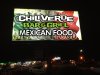
This is located in Louisiana, you do not want to cover up the flag with some quirky type.
The way he has it, fits the visual. Of course a new piece of acrylic would help but it seems money was an object.
The way he has it, fits the visual. Of course a new piece of acrylic would help but it seems money was an object.
John Butto
New Member
Legibility is only good if you can read english, if you went to Mexico and did not know the language and saw an American flag with comida y bebida, would you go in.
Marlene
New Member
I wouldn't know if I was going into a Mexican restaurant or an Italian Trattoria.
me either. our flag is pretty clear what it is as is the flag for England. a lot of other countries have bands of color and I can't tell Mexican flag from one from Italy or Ireland. having the words show up is what counts and I'm pretty sure people can read and why would that be a consideration? the sign is for a business in the USA and you worry about people being able to read another sign so why a Mexican Food place?
S
signs-work
Guest
Thanks for the advice. I work with signs to fit the customers budjet is why i used there face. I did explain that it may show through and it does but not that bad. I like the way you did that thats pretty cool Ill consider that for the next job thanks. The customers are extremely happy. No its not a masterpiece but its a work in progress. With what i have i like i and thats why i showed it off.
Border
New Member
Thanks for the advice. I work with signs to fit the customers budjet is why i used there face. I did explain that it may show through and it does but not that bad. I like the way you did that thats pretty cool Ill consider that for the next job thanks. The customers are extremely happy. No its not a masterpiece but its a work in progress. With what i have i like i and thats why i showed it off.
Nice to see that you acknowledge that there is room for improvement. Keep it up and keep your eyes on the other design critique threads here on s101. It will help you get better.

mountainmang
New Member
brother, if the customer is happy and happily paid for it, it's an awesome job ever do work in an office full of women? signs101 is not unlike that
ever do work in an office full of women? signs101 is not unlike that