C
ColoPrinthead
Guest
Never thought I'd be designing mattress posters, but here I am corporate for a furniture store. Was hired as Designer 2 (junior) hoping to focus on production, Designer 1 sucked and was let go after 3 painful months. Finally got some help and now have time to post.
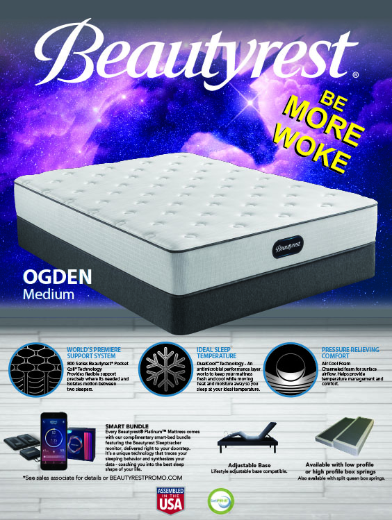
I looked at the branding guidelines from Beautyrest for this last one and told the mattress buyer it looked like mattresses in space so I went with different colored space backgrounds for a line of 4 mattress. The buyer is always in a hurry so I decided I'd have some fun with him on this one, he actually approved it before I pointed out the unicorn and we both got fired; Beautyrest's slogan is "be more awake" also.
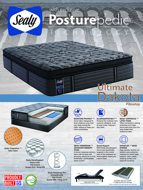
Sealy_Dakota_36x48Preview
- ColoPrinthead
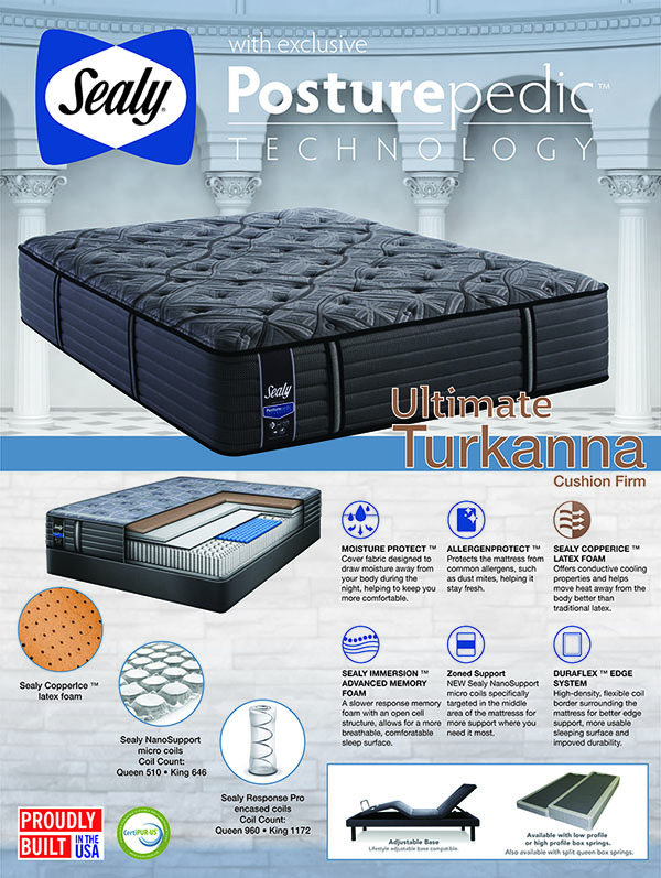
Sealy_Turkanna_36x48Preview
- ColoPrinthead
I looked at the branding guidelines from Beautyrest for this last one and told the mattress buyer it looked like mattresses in space so I went with different colored space backgrounds for a line of 4 mattress. The buyer is always in a hurry so I decided I'd have some fun with him on this one, he actually approved it before I pointed out the unicorn and we both got fired; Beautyrest's slogan is "be more awake" also.
OgdenProvenWOKEpreview
- ColoPrinthead
