• I want to thank all the members that have upgraded your accounts. I truly appreciate your support of the site monetarily. Supporting the site keeps this site up and running as a lot of work daily goes on behind the scenes. Click to Support Signs101 ...

Some recent work

C

ColoPrinthead

Guest
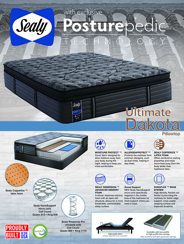
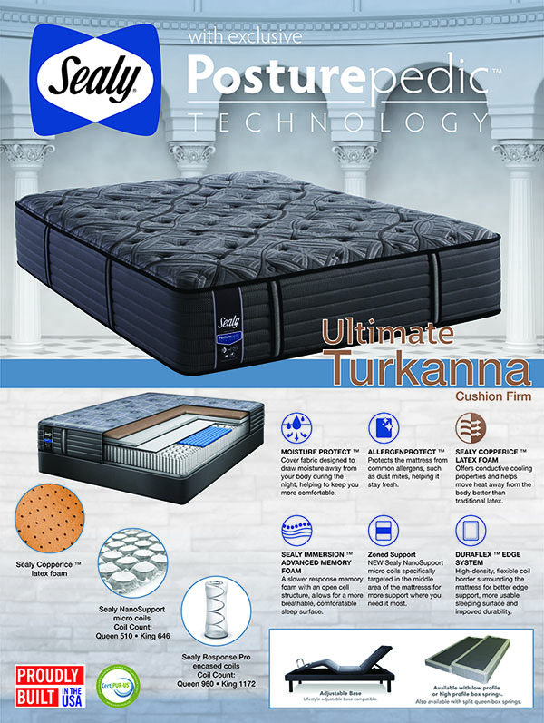
Never thought I'd be designing mattress posters, but here I am corporate for a furniture store. Was hired as Designer 2 (junior) hoping to focus on production, Designer 1 sucked and was let go after 3 painful months. Finally got some help and now have time to post.


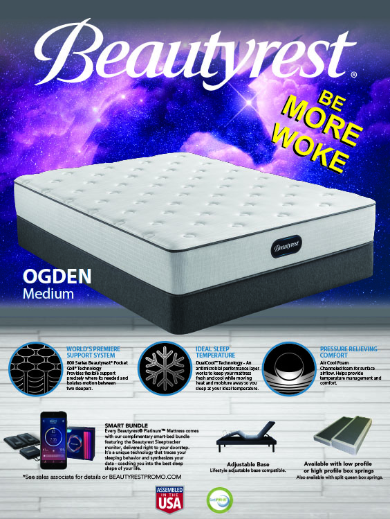
I looked at the branding guidelines from Beautyrest for this last one and told the mattress buyer it looked like mattresses in space so I went with different colored space backgrounds for a line of 4 mattress. The buyer is always in a hurry so I decided I'd have some fun with him on this one, he actually approved it before I pointed out the unicorn and we both got fired; Beautyrest's slogan is "be more awake" also.


2B

Active Member
why the change in themes?
you have 2 structural backgrounds and then a purple unicorn.

good work, easy to read
 
C

ColoPrinthead

Guest
Sealy v. Simmons. did the 2 sealy then did the Simmons Beautyrest a few weeks later, they don't want to be confused with each other.
 

Texas_Signmaker

Very Active Signmaker
Good job... Looks mattress-y.

I installed perf for a bunch of mattress stores 'round these parts... Did so many of them I started dreaming about mattresses..
 
C

ColoPrinthead

Guest
I have not thought much about mattresses until this job and now am going to buy a new one once I take the time to shop them.
 

bannertime

Active Member
Look pretty good. Was the unicorn worth it? lol

Isn't that interesting that our work brings us into so many different industries. I never cared about vape juice until I started making 40 different labels for a vape client. Now I'm looking at vape juice ads and whatnot to keep up with trends.
 

TimToad

Active Member
Never thought I'd be designing mattress posters, but here I am corporate for a furniture store. Was hired as Designer 2 (junior) hoping to focus on production, Designer 1 sucked and was let go after 3 painful months. Finally got some help and now have time to post.


I looked at the branding guidelines from Beautyrest for this last one and told the mattress buyer it looked like mattresses in space so I went with different colored space backgrounds for a line of 4 mattress. The buyer is always in a hurry so I decided I'd have some fun with him on this one, he actually approved it before I pointed out the unicorn and we both got fired; Beautyrest's slogan is "be more awake" also.


There are a couple of things that jump out at me, but overall they look good and like something I'd expect to see at a showroom. I like how you organized the features and cutaways in the bottom sections.

The model names spanning across your blue stripe and over the end of the mattresses seem like they could have been handled a little differently to help distinguish them from the multiple elements you've placed them over.

The font choice and angle of the "Be More Woke" are a little clumsy and mismatched for the more ethereal styling of that poster. Rotating the text to match the angle of the perspective of the mattress would help the text feel more intentional for the space they occupy.
 

Texas_Signmaker

Very Active Signmaker
I have not thought much about mattresses until this job and now am going to buy a new one once I take the time to shop them.

Just don't shop at those mattress retail outlets.. I've done sign work at hundreds of them and I talk to the workers there because 99% they are bored out of their mind. They say most customers walk out of there committing to $5,000 to $10,000 mattresses on payment plans. I've also seen them work deals with people so if you DO want to shop them, you CAN negotiate.

Personally, I bought a Simmons from Big Lots for $350 and it's the best. Most people don't think of Big Lots for that type of stuff but they have them right in the store to try out and buy.
 
C

ColoPrinthead

Guest
There are a couple of things that jump out at me, but overall they look good and like something I'd expect to see at a showroom. I like how you organized the features and cutaways in the bottom sections.

The model names spanning across your blue stripe and over the end of the mattresses seem like they could have been handled a little differently to help distinguish them from the multiple elements you've placed them over.

The font choice and angle of the "Be More Woke" are a little clumsy and mismatched for the more ethereal styling of that poster. Rotating the text to match the angle of the perspective of the mattress would help the text feel more intentional for the space they occupy.
I agree with your comments about the names on the bar. The "be more woke" was suppose to clue the buyer into that fact I was fucking with him on the design.
 
Top