-
I want to thank all the members that have upgraded your accounts. I truly appreciate your support of the site monetarily. Supporting the site keeps this site up and running as a lot of work daily goes on behind the scenes. Click to Support Signs101 ...
You are using an out of date browser. It may not display this or other websites correctly.
You should upgrade or use an alternative browser.
You should upgrade or use an alternative browser.
Still doing some stuff 'Old School'
- Thread starter SignosaurusRex
- Start date
SignosaurusRex
Active Member
There's two of the same layout.Lookin' good.
I see one, where's the other ??

IND Digital Dept.
@industryprintshop
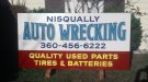
Really beautiful work! Has good flow and a nice color pallet. Only thing I could critique on is the drop shadows on "Wrecking"... With that wave in the text, it seems like the drop shadow should be on the Left side of the letters but just my two centsFor the 'Old School' crowd here still slinging paint... Last (2) 'Hand-Lettered' signs of the year 2017.
All 1-Shot lettering enamel on Alupanel®.

SignosaurusRex
Active Member
SignosaurusRex
Active Member
I should add that these were mounted back to back about 12 feet above grade along a busy highway.
SignosaurusRex
Active Member
Thank you, No, I would have had to use a flat and that wouldn't have given enough smooth coverage. I used a #20 Brown Quill to obtain good coverage without a second coat on the Dark Blue. The Yellow over Dark Red was a first coat of White with a dash of Silver added and then a second coat of Chrome Yellow lightened up with white.Very nice,
Johnny Best
Active Member
Thank you, No, I would have had to use a flat and that wouldn't have given enough smooth coverage. I used a #20 Brown Quill to obtain good coverage without a second coat on the Dark Blue. The Yellow over Dark Red was a first coat of White with a dash of Silver added and then a second coat of Chrome Yellow lightened up with white.
I am sure you had a good reason but why didn't you just cut in the red around the yellow copy on that bottom copy. Is it because of the brush strokes showing up to much?
Don't take it wrong on my question, the sign came out beautiful the way you did it.
SignosaurusRex
Active Member
I am sure you had a good reason but why didn't you just cut in the red around the yellow copy on that bottom copy. Is it because of the brush strokes showing up to much?
Don't take it wrong on my question, the sign came out beautiful the way you did it.
That would have taken much more brush work and time. Red doesn't cover worth a crap when brushed and it wouldn't have looked as clean.