-
I want to thank all the members that have upgraded your accounts. I truly appreciate your support of the site monetarily. Supporting the site keeps this site up and running as a lot of work daily goes on behind the scenes. Click to Support Signs101 ...
You are using an out of date browser. It may not display this or other websites correctly.
You should upgrade or use an alternative browser.
You should upgrade or use an alternative browser.
"Strecth the type to make it look better"
- Thread starter nikdoobs
- Start date
I saw that too... the story about NYC metro or something?
Yeah,I think that was part of it.
It's been a long time since I watched it, if I remember correctly it was about font foundries. Ariel was out but they needed a more readable font
and I think it tooks years for a team of people to create it.
Helvetica was created in the 1950's. Max Miedinger designed Helvetica (originally called New Haas Grotesk) with input from Eduard Hoffman for the Haas type foundry. The first release was in 1957. Linotype released Helvetica Neue in 1983. Earlier this year Helvetica Now was released by Monotype (which acquired Linotype GmbH in 2006).
Arial came much later, in the late 1980's. Some history about Arial from type designer Mark Simonson:
https://www.marksimonson.com/notebook/view/the-scourge-of-arial
The Helvetica documentary by Gary Hustwit is very good. A Blu-ray disc of it was released in 2007 the year the documentary was released.
Specifically what have I said in this thread that was nonsense? Before trying to give me tips on what to read or write in the forum, try proof-reading your own stuff before you post it. You claim you didn't post-while-drunk, but the text certainly appeared like it.
There won't be any need to tell the minimum wage guy on parole anything because that button pusher would be the guy who replaces our jobs. If a sign company or the sign industry at large just has self-taught designers who don't care about the quality of work they produce then there's no justification for them to even exist. The customer can do all that "design work" themselves. Anyone can squeeze or stretch Arial to fit in a box. If the customer is going to pay us do that work the customer is going to expect at least some level of competence, if not professionalism.
Arial came much later, in the late 1980's. Some history about Arial from type designer Mark Simonson:
https://www.marksimonson.com/notebook/view/the-scourge-of-arial
The Helvetica documentary by Gary Hustwit is very good. A Blu-ray disc of it was released in 2007 the year the documentary was released.
Gino said:The rest of your stuff, I had already said, long before you entered the thread. Possibly, try reading up on things before you just go around blurting out your nonsense.
Specifically what have I said in this thread that was nonsense? Before trying to give me tips on what to read or write in the forum, try proof-reading your own stuff before you post it. You claim you didn't post-while-drunk, but the text certainly appeared like it.
Johnny Best said:You can get a free ebook of it if you google the title "Of the just shaping of letters". It was a must read when I was young. But then again I don't care if people stretch letters. And I am sure if you told that parole guy who pushes buttons some grief you would be butt hurt for sure.
There won't be any need to tell the minimum wage guy on parole anything because that button pusher would be the guy who replaces our jobs. If a sign company or the sign industry at large just has self-taught designers who don't care about the quality of work they produce then there's no justification for them to even exist. The customer can do all that "design work" themselves. Anyone can squeeze or stretch Arial to fit in a box. If the customer is going to pay us do that work the customer is going to expect at least some level of competence, if not professionalism.
Gino
Premium Subscriber
You really want me to go back and re-read your stuff ?? Are you frickin' crazy ?? Most anyone can see your input has been all about you and your knowledge on the subject, which has nothing to do with solving the OP's problem. Granted, he's not gonna get a real answer, but most of your stuff was all about you, not helping the OP.
As for the drunk or not drunk state of my posting, I would consider treading lightly..... for you don't have a clue as to what you are talking about.
As for the drunk or not drunk state of my posting, I would consider treading lightly..... for you don't have a clue as to what you are talking about.
You must be a real blast at parties or social gatherings, huh ?? 

Texas_Signmaker
Very Active Signmaker
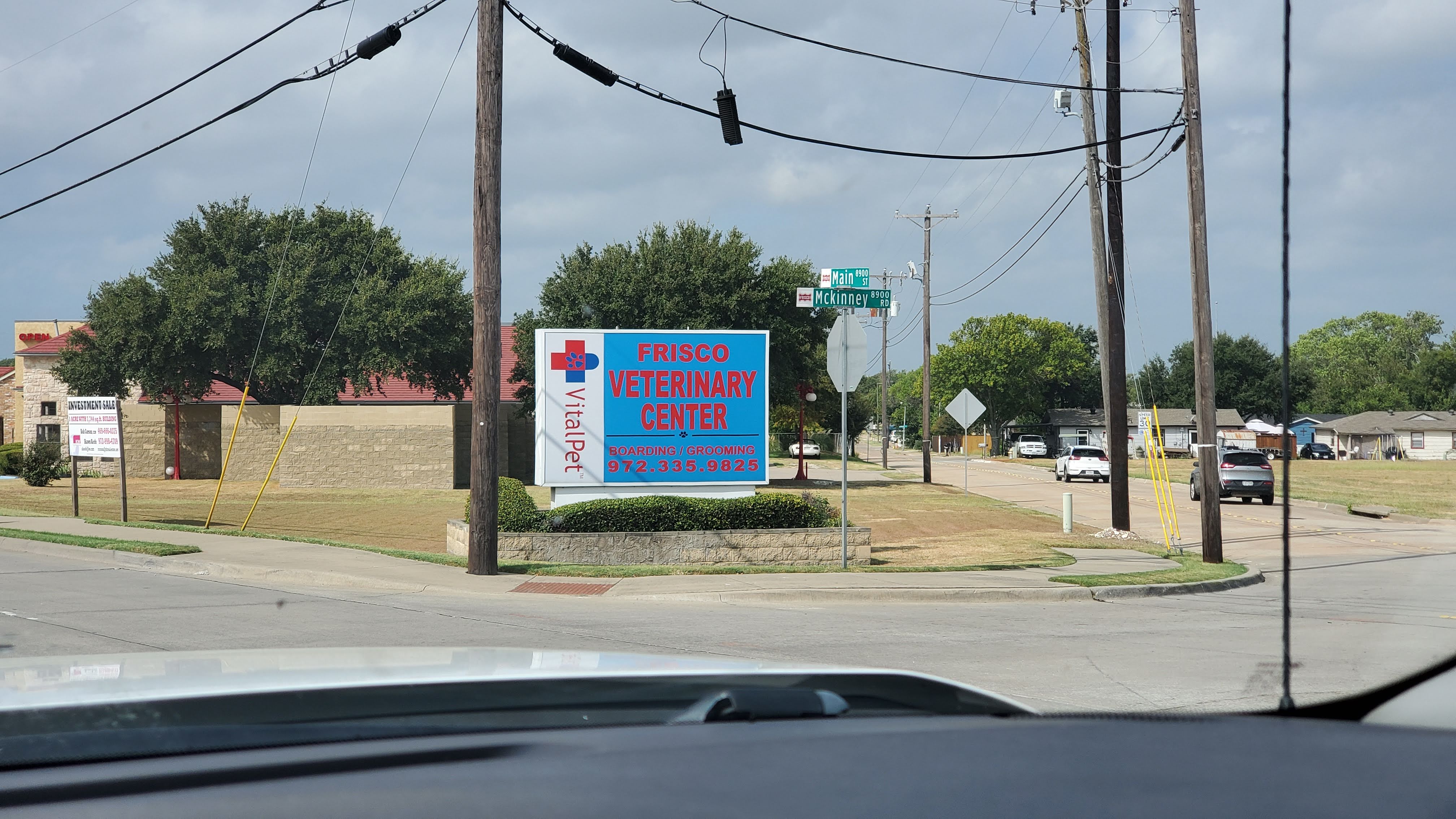
I found a good looking sign that isn't stretched. You can't read it because of the color vibration. This photograph I took actually makes it look 100% better.

http://www.adobepress.com/store/sto...ut-how-type-works-third-edition-9780321934284
Here is a great book to give the sales schmuck...
Here is a great book to give the sales schmuck...
Johnny Best
Active Member
I found a good looking sign that isn't stretched. You can't read it because of the color vibration. This photograph I took actually makes it look 100% better.
View attachment 143103
Dogs cannot see the spectrum of colors as we do so they used those colors on the sign for a reason. The dogs would not know where you were taking them.
Boudica
I'm here for Educational Purposes
Oh, my eyes. It hurts so much!
myront
Dammit, make it faster!!
Texas_Signmaker said:I found a good looking sign that isn't stretched. You can't read it because of the color vibration. This photograph I took actually makes it look 100% better.
Actually the only lettering on that sign that isn't squeezed or stretched it the "VitalPet" word mark running vertically on the left end of the face.
All of the Arial (spit) lettering on that sign face is distorted to some degree. "Frisco" is Arial Black squeezed slightly. "Veterinary Center" is Arial Black squeezed a LOT. "Boarding/Grooming" is Arial Bold stretched slightly. The phone number is Arial Black stretched modestly. Typical Arial @$$-tastic garbage design. The vibrating blue and red colors takes the crank-it-out-fast design to a lower level of suck.
Johnny Best
Active Member
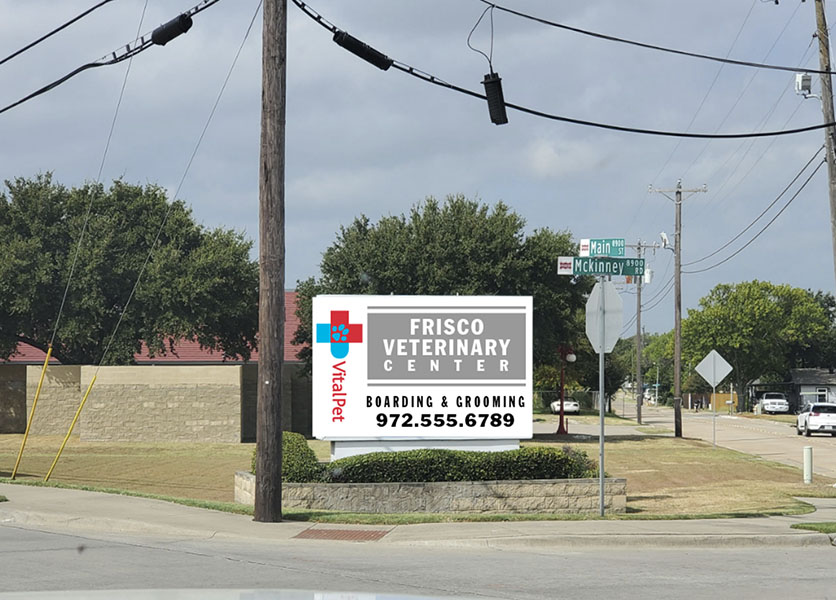
They used the red and blue on the main copy to match the logo, the cross with the dog paw, but realized the dark blue back was not enough contrast so they went with a lighter blue. So some thought process did go through someone's brain. Not a crank it out fast design to a lower level of suck as noted.
A crank it out fast design would have been logo and name on left and remaining with white back and black letters.
A crank it out fast design would have been logo and name on left and remaining with white back and black letters.
Johnny Best
Active Member
My crank it out fast.

Except the 10% part. We change kerning, font, line spacing but never stretch. And if you do those things you might want to leave a note in the design file in the event you have to replicate the job or do something else that mimics the same design.Nothing should be extended or squashed more than 10% from it's original size. If you can't find a type style which will work without making it illegible, then you're no designer or layout person. You s*ck, and that's all there is to it. Let WW III break out and teach him some design. Evidently, he is not what he thinks he is in his own little mind. Enlighten him. Does he ever come on here ?? Hope not, cause he won't learn much about design or layout.This place is only good for which printer should I buy, what font is this and where can I get the cheapest ink.
Johnny Best
Active Member
Thats a long trip from Guam, better to take the dog out in some deep water with a weight on his neck. Don't they eat dog on Guam?I dunno about your color choice Johnny - Black and Gray = Place to go to have my dog put down.
GAC05
Quit buggin' me
Only on special occasions and when McDonald's is closedDon't they eat dog on Guam?


