• I want to thank all the members that have upgraded your accounts. I truly appreciate your support of the site monetarily. Supporting the site keeps this site up and running as a lot of work daily goes on behind the scenes. Click to Support Signs101 ...

suggestions for Lot sign layout, sort of...

signgal

New Member
Hi. The developers are a client I've worked with quite a bit. I work primarily with the marketing gal and she talked them into a low budget revamp of the development to help sell some more homes. (Yay for me!)

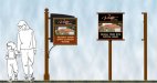
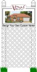
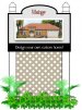
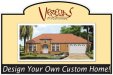
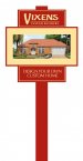
This is the lot sign I sold them on as a general idea. Each model will have a different rendering on the sign out front when they start building. I plan to figure out how to do the cool faded or swish-y edges (yes, those are the technical terms) on the rendering, so it's not a box. I've hacked up the logo for anonymity but wanted you to have the general shape for the cut out at the top. I tried an oval but the fit wasn't right. Neither of us is crazy about her line at the bottom... I tried "Custom Homes Designed by YOU!" but we weren't feelin' it.

They want it simple, which I've certainly given them LOL but I'm looking for a little cheap "punch" out of a one dimensional, digital print sign. Any suggestions?
 

Attachments

  • lot signs.jpg
    lot signs.jpg
    84.7 KB · Views: 142

signgal

New Member
I'll certainly take 'em LOL I'll take any suggestions... I know the restrictions make it difficult to be imaginative. But your consideration is appreciated :)
 
I'm not sure if the lattice is working. Can you make the sign taller and the lattice shorter or simply remove the lattice entirely?

It seems like an wasted expense if you are trying to do this cheaply.

~Chris
 

signgal

New Member
i like that, maniac (not surprising). no need to do the fancy footwork on the edge of the rendering... and i always like a reversed box.... nice. I'm gonna work on this and i know what you mean Chris but they are actually doing the install to save money and getting their own posts and lattice. when done right it does look a notch above a standard sign :)
 

SignManiac

New Member
Well if they insist on the lattice work, have them keep it inside the post so it doesn't mess up the vertical lines of the posts. I think Home Depot sells them already in a nice beige color.
 

Attachments

  • vistage2.jpg
    vistage2.jpg
    220.3 KB · Views: 137

signgal

New Member
since the lattice work's upsetting everyone LOL I went with pale mustard instead of grey because that's their color scheme. Better?
 

Attachments

  • lot-signs.jpg
    lot-signs.jpg
    19 KB · Views: 105

Gino

Premium Subscriber
So far, they're all bottom heavy. It just looks like someone got a picture making machine and just plopped a house on there.... kinda like Dorothy dropping a house on the 'Wicked Witch of the East'.
 

rjpjr

New Member
I was kinda thinking that the house is getting lost in all the lattice work and posts and structure. Maybe lose a post and lattice... This version is 24''x24'' but could easily work at a larger scale... Less expensive for the customer...
 

Attachments

  • Veredas-sign.jpg
    Veredas-sign.jpg
    29.5 KB · Views: 69

signgal

New Member
I was kinda thinking that the house is getting lost in all the lattice work and posts and structure. Maybe lose a post and lattice... This version is 24''x24'' but could easily work at a larger scale... Less expensive for the customer...

@ Gino... you're right. That was my fear in the beginning when I mentioned about working on the edges but RJ has a great solution.

really, really like this! the sign was actually 2' x 3' (not big) so i think the single post will be less cumbersome and as you say, save the client money. i was looking for something different and this fits the bill... colors are wrong, so I'll get to work on it.

Thanks for all the input!
 

signgal

New Member
a few variations on RJ's fab design...

I'm trying to incorporate the white because I know they will be using white posts. Also, they won't want their logo reversed. Let me know if you think any of these is a winner. :thankyou::U Rock:
 

Attachments

  • lot signs.jpg
    lot signs.jpg
    66.6 KB · Views: 115

Craig Sjoquist

New Member
I like the center one in post #16

your 1st one would have trash it myself

if your going low cost ..1 post, easy cut boards, easy graphics, easy install
 

Gino

Premium Subscriber
I think you need a better tag line. If I was paying a contractor for a custom home and wanted to be sure I was getting my input in there….. ‘designing my own custom home’ would make me wonder why I needed the contractor’s planner at all.
As for the layout….. could you make it less symmetrical and make the sign itself look custom ??
Here’s a quickie……. gal sign.jpg
 

signgal

New Member
Thanks for the tagline help, Gino! That was a big concern for me from the OP but no one jumped on it. the fear of the buyer wondering that very thing made me scrap my tagline right away too. more input on the tagline would be welcome.

I love your asymmetrical idea. Not sure I can pull it off with this job. I'm already pushing it with these vanilla-right angle clients as it is LOL
 

Rick

Certified Enneadecagon Designer
I have done quite a few residential marketing signs, one of the big things I was always told by the marketing people was darker colors say 'custom' or 'luxury' Quite a few of these developers around here take these signs (and their showrooms and model homes) very seriously.

I would stay away from adding shapes to the panel, instead build a nice post/frame.

Reverse reads better.

I would always add a sale person to get the idea of the scale and proportion you are working with, when i was reading the, I was thinking this sign was a lot larger.
 

Attachments

  • custom homes.jpg
    custom homes.jpg
    82 KB · Views: 129
Top