-
I want to thank all the members that have upgraded your accounts. I truly appreciate your support of the site monetarily. Supporting the site keeps this site up and running as a lot of work daily goes on behind the scenes. Click to Support Signs101 ...
You are using an out of date browser. It may not display this or other websites correctly.
You should upgrade or use an alternative browser.
You should upgrade or use an alternative browser.
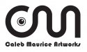
Thoughts On This Logo?
- Thread starter HaroldDesign
- Start date

MatthewTimothy
New Member
if you are trying to display the CMA in a joint fashion then no, your logo doesnt do that. Also your logo looks really similar to one ive seen before. Whats the purpose of the dot?? Whats the purpose of the whole logo? The font used at the bottom is hard to read.
slipperyfrog
New Member
Sorry but the first thing I thought when I looked at this was a wiggly, single cell swimmer that comes from the male reproductive system.
HaroldDesign
New Member
:ROFLMAO: Crap. Back to the drawing board.
Marlene
New Member
the top part looks like a boob with a squiggle. the font used for the name is really complex with a lot of shapes within it. the name is so long, it feels like a work to read thru it. it's hard to read a font with lots going on and there are just too many twists and truns not to mention the issues with kerning. that font looks better with a short word or just one word.
Pixels Are Bad Mmmkay?
New Member
I thought "bike rack?"
TyrantDesigner
Art! Hot and fresh.
oldgoatroper
Roper of Goats. Old ones.
the first thing I thought of was the CN logo and wondered what cute little way this logo would relate to the same railroad motif the CN logo represents.
TyrantDesigner
Art! Hot and fresh.
Alright, after really looking it over, does not come off as CMA ... comes off as OM with the O being a boob ... as in OM NOM NOM. heh. good if that is what you want. bad if you want to be anything else. My suggesstion, make it look like CMA as one big line, avoid the nipple eye thing and make sure that the design is a little bolder than what you have ... from a distance it looks like a bad hash mark. Either that or go completely custom, grab a brush and paint and go to town drawing CMA over and over again until you find one that is unique and stylized they way you want ... then vector and bobs your uncle, done.
HaroldDesign
New Member
Circleville Signs
New Member
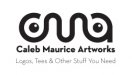
Now it looks like a geeky professor. Can I ask why you are so married to the idea of the single line?
HaroldDesign
New Member
I'm not married to anything. These two attempts are thoughts on paper that I am now done with. Over. Dead & buried. Gone forever.Now it looks like a geeky professor. Can I ask why you are so married to the idea of the single line?
Circleville Signs
New Member
I'm not married to anything. These two attempts are thoughts on paper that I am now done with. Over. Dead & buried. Gone forever.
LOL - fair enough
")
One thing that I would suggest doing - and from experience I can tell you that it is insanely difficult with your own branding...
Try to seperate what you like from the equation. Think about who your target customer is, and then design based on what will appeal to them.
HaroldDesign
New Member
I'm having a pretty hard time. Here is a little background;LOL - fair enough
One thing that I would suggest doing - and from experience I can tell you that it is insanely difficult with your own branding...
Try to seperate what you like from the equation. Think about who your target customer is, and then design based on what will appeal to them.
For some years now I've been doing artwork, logos, signs etc on the side. I pay taxes under the name of Caleb Maurice Artworks. However, I do not actually have a "business" name that I do any advertising with whatsoever. I figured I might as well use "Caleb Maurice Artworks", but I'm now thinking that may not be good. I really need to come up with a name. It's too long! I keep buying more equipment and doing more jobs and I don't even have a damn name to advertise with. My market is local small business. Basically I make shirts as a vehicle to up-sell them on quality press-ready artwork. Many businesses in my area don't realize their art is not even useable on a shirt. Anyway - I'm really stuck! I would love to come up with something with fresh appeal!
quicksigns
New Member
looks like a boob from front view and boobies from top view:ROFLMAO:
signage
New Member
Now you just toying with us. That's an ad for glasses, huh ?? For someone with two noses.
Or a really big nose
 :Big Laugh
Circleville Signs
New Member
You very well may want to consider hiring this out. Philip Newel (Sign Amigo) does excellent work at a VERY reasonable price.