-
I want to thank all the members that have upgraded your accounts. I truly appreciate your support of the site monetarily. Supporting the site keeps this site up and running as a lot of work daily goes on behind the scenes. Click to Support Signs101 ...
You are using an out of date browser. It may not display this or other websites correctly.
You should upgrade or use an alternative browser.
You should upgrade or use an alternative browser.
Thoughts on this
- Thread starter Doyle
- Start date
Circleville Signs
New Member
Second one for sure.
Ties it all together MUCH better.
Gary
Ties it all together MUCH better.
Gary
TheSnowman
New Member
You may also want to think about if this ever has to be cut vinyl, or embroidered. Might be hard to do some of this...however, I don't know anything about embroidery. I do like the 2nd one though...looks good.
HeavyHitter
New Member
or this?
I like the wrench in the logo. Being a gear head I think the logo would be missing something without it. Nice...

The Equipment Guy
New Member
I have not drawn a thing since pastels were in, but my first instinct would have been to Script "Brians". That being said, I like the yellow and the closed end wrench and liked the version with the second choice of typeface on the city.
Craig
Craig
Last edited:
visualeyez
New Member
Mechanics wouldn't use a 12pt wrench on a 6pt bolt. Looks silly. And wourk on the bolt head a little more, or make it a nut with a bolt being swrewed through it from the other side. Maybe lighten up the wrench with a more complex gradient / bevel. Maybe try replacing the black outline with a dark bronze.
CustomRide
New Member
I think the wrench interferes with Automotive too much.
Maybe an adjustment kinda like this...
This looks like 2 bullet holes "almost"
auto accents sc
New Member
What about twisting the wrench over. Leaving the box end as the "o" same direction(open on left side of logo) but have open end other way. For some reason it looks awkward to me.
A 12 point wrench is used on a 6 point bolt/nut because of limited working room... allowing you to bite it and turn it with less twisting room available.
I'm liking the last one you posted the most so far. The city/state font still aint quite right. Nice work though.. and nice wrench.
I'm liking the last one you posted the most so far. The city/state font still aint quite right. Nice work though.. and nice wrench.
weaselboogie
New Member
A 12 point wrench is used on a 6 point bolt/nut because of limited working room... .
I may use a 12 point wrench because it may be the only one that I can locate at any given time. I may add that I wouldn't be too picky if it were metric on a standard either... as long as it kinda fits... kinda.

Blazingsun
New Member
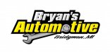
Last one Looks Good, but the "Autom" over the wrench with the shadowing looks odd..looks like three layers:
1.autom (Top)
2.wrench (Middle)
3.tive (bottom)
I think you need to give the "tive" the effect that its at the same level as "Autom"
just my 2 cents.
1.autom (Top)
2.wrench (Middle)
3.tive (bottom)
I think you need to give the "tive" the effect that its at the same level as "Autom"
just my 2 cents.
Does the wrench work? What do you think overall?
The wrench is 2D, while the text is beveled, making it look 3D. If it were me, I'd give the wrench a little more dimension...not by beveling. Perhaps just make a clone of it, darken the clone, drop it below the first wrench, and alter the vectors so that it looks like a natural and simple "3D" effect. Considering the simplicity of the design, it shouldn't take too much to make it work.
Also, the colors on the wrench are probably a bit too bold...the gradient it too obvious as a gradient rather than naturally looking like a "sheen" across the metallic surface.
As for anything else...I'd say change the corners of the stroke to rounded instead of sharp. Might make it look less abrupt.
Just my thoughts on it