Sticky Signs
New Member
Dang you sticky signs! why does everything have to have been done before!
HAHAHA. Don't blame me. Blame Dan Antonelli!!!
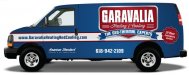
I do like the reversed colours. Looks good.
Dang you sticky signs! why does everything have to have been done before!
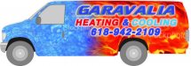
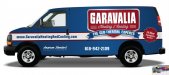
Now that I've gone this far, I should let the client know that I think we should wrap his vehicles...
I like it, What program did you use?
I think the pinstripes really added to the design and gave it more retro character. Yes, they may be a b1tch to install but it would be worth it.
:ROFLMAO: :ROFLMAO: :ROFLMAO:
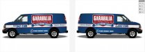
While I was saving the proofs, I came across the ones I designed for them 4 years ago when I had just started in signs and design. LOLOLOLOLOL

:ROFLMAO: :ROFLMAO: :ROFLMAO:
While I was saving the proofs, I came across the ones I designed for them 4 years ago when I had just started in signs and design. LOLOLOLOLOL
Man that was a good laugh! Thank goodness they did not accept my designs then!
This is proof that you can start your career with no promise, and get (a little) better.
:ROFLMAO: :ROFLMAO: :ROFLMAO:
Man that was a good laugh! Thank goodness they did not accept my designs then!

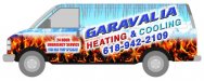
The 2nd one killing pinstripes bad idea....
I think the pinstripes really added to the design and gave it more retro character