-
I want to thank all the members that have upgraded your accounts. I truly appreciate your support of the site monetarily. Supporting the site keeps this site up and running as a lot of work daily goes on behind the scenes. Click to Support Signs101 ...
You are using an out of date browser. It may not display this or other websites correctly.
You should upgrade or use an alternative browser.
You should upgrade or use an alternative browser.
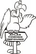
Towing Logo
- Thread starter Joe Diaz
- Start date

SignManiac
New Member
Very clever Joe...The client missed out.
TheSnowman
New Member
Yep, I'd have rolled with it. My tow customer we did a nice layout for on their truck decided when they advertise in the paper to advertise "TOEING" and has a picture of a tow truck pulling a foot, with a hook through the toe. I can't hit my face on the table enough each time I flip through the paper.
Sign Up Graphics
New Member
Nice!
- - - Updated - - -
Nice!
- - - Updated - - -
Nice!
Dan Antonelli
New Member
Homerun Joe.
- - - Updated - - -
Homerun Joe.
- - - Updated - - -
Homerun Joe.
SignosaurusRex
Active Member
This is the first time I have not liked one of your ideas Joe. In all honesty, I would have to agree with the customer.
....and a Broken Egg used in conjunction with the name BIRD'S. Images of broken or wrecked stuff in a towing / wrecker service logo never go over well.Maybe because it looks too much like a crane coming out of the egg instead of a tow truck?
ThinkRight
New Member
You can lead a horse to water but...
It looks good.
Maybe try using a stork for the bird carrying a wrecked car...?
- - - Updated - - -
It looks good.
Maybe try using a stork for the bird carrying a wrecked car...?
- - - Updated - - -
Joe Diaz
New Member
Thanks everyone. The client ultimately didn't want to use any bird imagery in the logo. We discussed it early on and he said he wasn't sure about using bird imagery back then, but wasn't 100% against the idea. He was curious to see what I would come up with. So.... I could tell then his heart wan't totally in it. But the idea hit me, and I thought I would try. It was just one of a few ideas. He actually chose to use everything else but the egg. So the lettering and the hook made the cut.
Well It's not really a broken egg, it's a hatching egg. And inside is a cute little baby tow tuck. LOL. Either way, It didn't make the cut so no big deal. I'm happy with how it turned out, he's super happy with it. Got the truck scheduled, and we began talking about designing his print collateral and shirts. So.... all is good.This is the first time I have not liked one of your ideas Joe. In all honesty, I would have to agree with the customer.
....and a Broken Egg used in conjunction with the name BIRD'S. Images of broken or wrecked stuff in a towing / wrecker service logo never go over well.
Dan Antonelli
New Member
This is brilliant. The reason why is that it relates to the name in a meaningful way, and is atypical of what is expected within the genre. When every uses a tow hook, then it's time to use something else. Too bad the client didn't have the vision to understand why this would have been a great approach to brand his business, to stand out, not fit in. When everyone zigs, you need to zag. Are you more likely to remember this, or remember tow hook for a tow company.
The thinking behind this shows that not only is Joe a great designer, but is also skilled in advertising, and logic behind good branding.
The thinking behind this shows that not only is Joe a great designer, but is also skilled in advertising, and logic behind good branding.