• I want to thank all the members that have upgraded your accounts. I truly appreciate your support of the site monetarily. Supporting the site keeps this site up and running as a lot of work daily goes on behind the scenes. Click to Support Signs101 ...

Two logo redesigns -- what say you?

oldgoatroper

Roper of Goats. Old ones.
Ok, I'm not sure there's going to be many people around here on Christmas Eve to look at this, but I'll give this a try anyway...

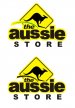
The Aussie Store is a high-end clothing store in a fancy mall. RM is a clothing label.

The images show what is existing (above the line) and what my mind has struggled to conceive. (below the line)

Both are going to be used on tags and labels. The Aussie logo is eventually going to replace the existing fascia in the mall and will probably be a CNC cut single face with maybe 8" Let-R-Edge and LED backlighting.

What would you guys do?
 

Attachments

  • logo - RM Outfitters.jpg
    logo - RM Outfitters.jpg
    33.3 KB · Views: 93
  • logo - The Aussie Store.jpg
    logo - The Aussie Store.jpg
    39.3 KB · Views: 64

Circleville Signs

New Member
Well, the Aussie one doesn't say high end to me in any way. Neither their existing logo, or your re-drafts. Of your re-drafts, the bottom left is the best, but overall the best is their existing one on the right.

The clothing label, I think the direction is solid, but I'm not sure I like the border. And the "R" feels like it should be a "B", but someone forgot 1/4" of line :)
 

oldgoatroper

Roper of Goats. Old ones.
Well, the Aussie one doesn't say high end to me in any way. Neither their existing logo, or your re-drafts.


Yes, agreed. Perhaps I should clarify. The store is stupid expensive high-end stuff that they want to portray as casual, rough, durable, Aussie, don't-give-a-damn, redneck, he-man..... etc., etc....
 

Smacka

New Member
Maybe try enlarging the kangaroo and place to the left cutting into the text to make it the focal point. Try an all caps extra bold font for this. Lose the script font, that font is only good for surfboards :doh:
 

Tiki

Font Sage
Maybe change the typeface on the original use a simple sans font change the yellow copy to black copy with yellow outline
 

Attachments

  • 1aaa.jpg
    1aaa.jpg
    60.5 KB · Views: 62

oldgoatroper

Roper of Goats. Old ones.
Gary: Yes, the 'R' needs some attention.

Smacka: Interesting idea, but they would like to keep 'Aussie' as the focal point

Carl: At one point we talked about mirroring the 'roo, but someone pointed out that in Aussieland, they drive on the wrong side, so that's how the signs are oriented. Also, though I usually face things left, it somehow appears to be fighting the flow when I tried it.

Tiki: Very interesting look. You've got me thinking again. And despite being a Font Sage, you've managed to accomplish that with Arial.
 

neato

New Member
I like Tiki's idea. But I might even make it rougher looking (think Dungarees) and maybe to look like a hang tag...
 

Attachments

  • aussie.gif
    aussie.gif
    16.3 KB · Views: 109

neato

New Member
It does look greenish. I was going for more of a tan/burlap color.
 

Attachments

  • aussie2.gif
    aussie2.gif
    16.5 KB · Views: 108

oldgoatroper

Roper of Goats. Old ones.
Green and gold/yellow are the aussie colours -- the green actually looks better, I think...

well, maybe not better, but certainly satisfies the requirement for green.
 
Top