• I want to thank all the members that have upgraded your accounts. I truly appreciate your support of the site monetarily. Supporting the site keeps this site up and running as a lot of work daily goes on behind the scenes. Click to Support Signs101 ...

Ugly signs thread?

Marlene

New Member
OK, the green one with the gold lettering was "designed", and I use that term loosely, with the "help" of a customer, my one and only time designing with a customer sitting beside me helping. I charged him big big bucks to sit there and the sign is sooo nice. I love the contrast as well as the nice graphics.

the other one is from a "designer" and I also use that term loosely. they made me make this sign, ugh.
 

Attachments

  • green mt.jpg
    green mt.jpg
    11 KB · Views: 58
  • MAJESTIC2a.jpg
    MAJESTIC2a.jpg
    21.9 KB · Views: 53

JR's

New Member
This is one of my favorites, three different letter style's, a relief shadow a convex blended shadow a drop shadow and some outlines.
There's more bells and whistles on this sign then a whole fleet of firetrucks.
 

Attachments

  • not good 1.jpg
    not good 1.jpg
    53.3 KB · Views: 63

cptcorn

adad
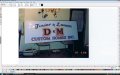
Here are some of my layouts from when I first got a computer.
Most of these are from about 1998, but one is newer, about 2002.
Puke-a-riffic.
Some of these places are out of business (the ones with the phone numbers) and were heavily dictated by the client.
The others are 100% me thinking I was such hot sh!t.
:design:
I was more like an idiot with some clipart and a few fonts.
It's more fun to rip on myself than someone else, really.
I changed them to black and white but left the Algerian, Brush Script, and distortions alone.

LOL I've used that same tow truck graphic!!! hahahahaaa
 

Jillbeans

New Member
JRs back in 88 I would have been damn proud to produce something like that.
And the customer provided that font and the sporty stuff to me from some HUGE honkin' clip-art set! It wasn't vector though and it took hours to get it all cleaned up.
 
S

scarface

Guest
saw this today, looks like a style of comic sans on a banner and more importantly was the banner was ghetto tied to the back of this van lol
 

Attachments

  • 1.jpg
    1.jpg
    51.4 KB · Views: 73

Service Sign Co

New Member
I found some old photos from the late 70's & early 80's This one definitely falls into the category of "what was I thinking"
 
Last edited:

CentralSigns

New Member
Thats your bad stuff. My competition's got stuff worse than that all over town. Slowly replacing it though. His backlit stuff is all in three or four pieces. One in particulr you can see the two cracks plain as day, 1/2 in cracks that is, light just streaming through the cracks. I guess he's never seen 3/8 rollstock, he'd use 4' by 8' sheets and cut them down so every 8 feet there's a crack. Great town to set up in.
 

iSign

New Member
here's some crap design I did my first year in business. Sad part is these were printed on rice paper so I could have them laid into the fiberglass on my new $600 surfboard I was getting in a trade for some rice papers for Jimmy Lewis, a top board shaper... so I still have the board in great shape (I don't get out enough) but it also still has these ugly graphics...


oh well, at least I have a shot at winning the ugly sign contest!

Offsite Pic Replaced or removed Please Observe Our Photo Posting Rules
 

Attachments

  • uglycontest.jpg
    uglycontest.jpg
    15 KB · Views: 57
Last edited by a moderator:

Jillbeans

New Member
I saw dueling dog grooming shops on opposing corners yesterday.
One was made with stencils and had the prerequisite paw prints.
The other was a "real" sign.
Difference was night and day. Alas, I did not have a camera and would have probably wrecked if I tried to use the one in my cell phone.

Doug I used avant garde on a logo this week and thought of you the whole time.
:)
And I am too lazy to go digging back into the Win98 machine for more gems I've done.
 

Rooster

New Member
OK This isn't technically a sign, and they are students but it was simply too good to share. This is a file they sent me by mistake. The file I printed looked much better.

I should have known what was coming when they asked if I could print a MS publisher file.
 

Attachments

  • Bad-Poster.jpg
    Bad-Poster.jpg
    87.3 KB · Views: 62
Top