SignManiac
New Member
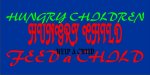
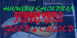
So I received an order for 500 banners for a customer in Malaysia, and I've worked up a design and could use some feedback. They wanted something bold so I thought bright colors would really get the message across. I'm not sure about the cursive lettering though. Any suggestions are welcome.

 Champion Expo?!?