• I want to thank all the members that have upgraded your accounts. I truly appreciate your support of the site monetarily. Supporting the site keeps this site up and running as a lot of work daily goes on behind the scenes. Click to Support Signs101 ...

What'cha think of this design?

signmeup

New Member
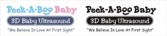
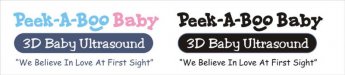
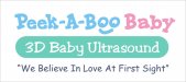
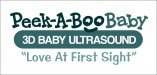
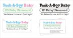
This is for a gal who does ultrasounds for new moms to be. Strictly non-medical entertainment purposes. She wants something fun. The rectangular with the round corners will be a dimensional sign for the lobby.

I thought Jillbeans was the perfect font for this. I bet I get some comments on the other font I used. :biggrin:

I see this is my 3000th post.
 

Attachments

  • PeekABooSm.jpg
    PeekABooSm.jpg
    42.7 KB · Views: 123
Last edited:

JR's

New Member
I like the choice of font. The layout is good. And it looks like the logo will work in all kinds of venues.
On my screen the colors look washed out, maybe add a light navy blue outline.

Congratulations on your 3000 post.

J.R.
 

signmeup

New Member
Thanks JR. The colours are pastel but it does look a little off what I want on my screen too. The yellow in particular. I can't get a good pastel yellow for some reason.....looks a bit greyish on my machine. I know I can get the colours I want in paint and cut vinyl. It will need to go online so I will have to figure it out. I like it in black the best.
 

B Snyder

New Member
I would be recommending full color cards with a 3D ultrasound image on it. Seeing a 3D ultrasound image is what sells the service.
 

Jillbeans

New Member
I'm flattered you like the font, and you know me, I just love babies.
I like the "oo" making the face in Peekaboo.
I don't mind the bottom font. haha
But I do not like the green. Can't see any yellow!
I think I'd make that a black (or navy) blue panel with white lettering.
(kinda like an Xray or sono has a lighter image on a darker background)
(if memory serves)
If using navy, make the bottom copy navy too.
Love....Jill
 

signmeup

New Member
3d ultrasound looked like poopy browns to me. Here it is with your suggestions Jill. Thanks for looking.
 

Attachments

  • PeekABooBlooSm.jpg
    PeekABooBlooSm.jpg
    25.6 KB · Views: 91

Circleville Signs

New Member
I think the mint green looks better than the earlier versions.

It feels like there should be a way to make the 3D Baby Ultrasound and surrounding shape actually LOOK like an ultrasound image...Maybe with some photoshop work? I dunno - just an idea.


Gary
 

abadsvt

New Member
I like that last one with the teal and mint! It has some personality but not too much. I think it will appeal to everyone. Good job!

Josh
 

SignManiac

New Member
The design is starting to come together. My only suggestion would be to shorten up "we believe in love at first sight" to simply, "Love at first sight". It just seems to sum it all up as simply as possible.
 

Shovelhead

New Member
I think it should look more like a medical industry business and not a day-care....but
that's purely an aesthetic opinion.
 

Tiki

Font Sage
Increase the size of PeekABoo Baby Try a light grey outline around the mint green
Maybe put the tag line on top
 

signmeup

New Member
The design is starting to come together. My only suggestion would be to shorten up "we believe in love at first sight" to simply, "Love at first sight". It just seems to sum it all up as simply as possible.
I'll run that by them. Thanks.
 

signmeup

New Member
I think it should look more like a medical industry business and not a day-care....but
that's purely an aesthetic opinion.
I approched that very subject with the customer but she said it was exactly the opposite feel they were after. They aren't allowed to use the machine in any medical capacity. She said they don't even wear lab coats. They want it to feel like you're with your family at home... ( the grandparents, kids, friends and Mom and Pop attend this .) so it cuts out any medical imagery I could have used.
 

Jillbeans

New Member
I think I would like it better if the part in the panel was all-caps.
 

Attachments

  • Graphic2.jpg
    Graphic2.jpg
    223.9 KB · Views: 99
Top