-
I want to thank all the members that have upgraded your accounts. I truly appreciate your support of the site monetarily. Supporting the site keeps this site up and running as a lot of work daily goes on behind the scenes. Click to Support Signs101 ...
You are using an out of date browser. It may not display this or other websites correctly.
You should upgrade or use an alternative browser.
You should upgrade or use an alternative browser.
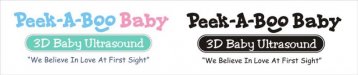
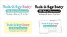
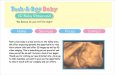
What'cha think of this design?
- Thread starter signmeup
- Start date
")
Jillbeans
New Member
Looks like the same attachment? Could be my imagination tho.
Which font?
Coolvetica
Rager
I think Tiki's is
Teen
Which font?
Coolvetica
Rager
I think Tiki's is
Teen
signmeup
New Member
Looks like the same attachment? Could be my imagination tho.
Which font?
Coolvetica
Rager
I think Tiki's is
Teen
No, no....the other one.....Wait....I have it here....it's Jillbeans!!!
signmeup
New Member
Charlie J
New Member
I think it should look more like a medical industry business and not a day-care....but
that's purely an aesthetic opinion.
I agree with shovel.
Overall I'd say it doesn't really appeal to me. But then again I think i'm far from the target viewer.
signmeup
New Member
Shovel may well be right but the client wants a non-medical look....to the point of consiously avoiding anything medical. Got to keep the customer happy.I agree with shovel.
Overall I'd say it doesn't really appeal to me. But then again I think i'm far from the target viewer.