• I want to thank all the members that have upgraded your accounts. I truly appreciate your support of the site monetarily. Supporting the site keeps this site up and running as a lot of work daily goes on behind the scenes. Click to Support Signs101 ...

Which icon character for logo

Atomic DNA

New Member
I've been working on this bad beanie logo until I'm blue in the face. I've narrowed down to these three variations. Which one do you prefer? I wanted it easy to reproduce and more iconic than a charter, really. Definitely getting closer since my last post.
 

Attachments

  • Screen Shot 2013-02-01 at 6.00.42 PM.png
    Screen Shot 2013-02-01 at 6.00.42 PM.png
    44.8 KB · Views: 69

mudmedia

New Member
I've been working on this bad beanie logo until I'm blue in the face. I've narrowed down to these three variations. Which one do you prefer? I wanted it easy to reproduce and more iconic than a charter, really. Definitely getting closer since my last post.

I do not prefer any of them but If I had to choose one I would say the top one. I am not sure what the horns are for on the lower two?
 

Atomic DNA

New Member
I am not sure what the horns are for on the lower two?

Playing off of the word bad. I've sent this to a few of my friends, my wife, my sister, and they all seem to choose the top one and the bottom left is second. Pisses me off. I like the devil horned version as it is symmetrical and simple. I think they choose the one on top because it is "different" than the other two, making it more special. I don't know. Frustrated is a word that comes to mind.
 
I like the bottom left one. I think it's perfect, in my opinion, for the image you are wanting to convey...a BAD beanie. I think it's straight and to the point and I would buy probably buy one.
 
You know, now that I'm going back and looking at this again, could it be too Marvin Martian-like? Maybe try making the face and horns red, but with a black beanie.
 

bob

It's better to have two hands than one glove.
The bottom two look like De Tar Baby's evil twin. The top one looks like a creature with terminal hemorrhoids.
 

Atomic DNA

New Member
The bottom two look like De Tar Baby's evil twin. The top one looks like a creature with terminal hemorrhoids.

I laughed when I read this. I'm still going to be tweaking on it a bit. I'm going to focus on the lower left.

I respect everybody's opinion. Well, mostly everybody :smile:.

Colorado, tacky in what sense? Please be more informative as to why you do not like it. The more negative/positive feedback I get will get me closer to the final result. Ultimately it will be up to me, I just have to try to convey as best as I can to what have in my head to the software.

This product line will be retail-based along with a website focused on niche groups. I am trying for a bad (but no so bad) symbol that has attitude but at the same time being easy to reproduce, hence no detail or many colors.
 

wildside

New Member
I kinda like where your headed with it.... but I would do what jmortiz just said about making the face and horns red and a black beanie. I think that might help the effect you are going for
 

Atomic DNA

New Member
I went ahead and swapped the colors and while I was at it I tweaked the hat shape to more of a actual beanie shape. I feel like I'm getting there, slowly.
 

Attachments

  • Screen Shot 2013-02-02 at 5.27.39 PM.png
    Screen Shot 2013-02-02 at 5.27.39 PM.png
    21.3 KB · Views: 50

Moze

Precision Sign Services
I think it looks pretty good.

Two immediate thoughts:

- Just looking at the thumbnail, the eyes look a tad 'sleepy' - needs more 'bad' :)
- I think it needs a partial highlight around the bottom of the hat, similar to the highlight around the horns
 

Marlene

New Member
The bottom two look like De Tar Baby's evil twin. The top one looks like a creature with terminal hemorrhoids.

the creature with terminal hemorrhoids seems to work better than De Tar Baby's evil twins. so what is "bad" about these hats? can you convey that with any of these images? who buys them? will the image sell to them? if you make an image will it be on the hat or just on the website?
 

Atomic DNA

New Member
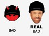
haha. Chuck Norris for the win.

Moze, I contemplated about a grey trim to show the roll of the hat. I'll work with it.

Marlene, after working with Mr. Hemorrid, it kind of reminds me of the 7-up dot. A little too cute.

The "Bad" is just a gimmick I suppose. These hats will be focused to niche groups that may have a "Hey, look at me" attitude. Rock bands, certain car clubs, skaters, paintball, etc. Just a gimmick.
I guess I could use a cliche skull or whatever but I was trying to be neutral as this product will be focused to other organizations such as schools and whatever.
 

Atomic DNA

New Member
Okay. I am happy with my text layout. The tail will tie in with my beanie guy's horns.
 

Attachments

  • Screen Shot 2013-02-02 at 8.33.51 PM.jpg
    Screen Shot 2013-02-02 at 8.33.51 PM.jpg
    71.2 KB · Views: 83

Atomic DNA

New Member
This is a PS version. The base colors are in vector. I just wanted to see how it looked with embellishments. It will stay in a 3 color spot for reproduction purposes.
 
Top