-
I want to thank all the members that have upgraded your accounts. I truly appreciate your support of the site monetarily. Supporting the site keeps this site up and running as a lot of work daily goes on behind the scenes. Click to Support Signs101 ...
You are using an out of date browser. It may not display this or other websites correctly.
You should upgrade or use an alternative browser.
You should upgrade or use an alternative browser.
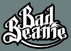
Which icon character for logo
- Thread starter Atomic DNA
- Start date

bob
It's better to have two hands than one glove.
What about somehow adding the beanie in the void space to the left. I just moved it there real quick to see if it would look ok. Would have to wrap it around the top and bottom B's.
The thing with blackletter is that even under the best conditions it's hard as hell to read. The 'B's are passable but the 'ad eanie' is hard on the eyes. Aggravated by the depressing color scheme.
Why not try leaving the 'B's as decorative initials and make the 'ad eanie' in some not discordant but legible type face? See what that does for you.
Then, if you simply must have a representation of the product, by all means have the 'B's wearing it.
John Butto
New Member
itslate
without the skull look
without the skull look
Atomic DNA
New Member
I went ahead and tweaked a few more things. Made revisions to the B's that fairly resembled "R"s. Adjusted the kerning for better legibility. Changed the tail that starts on the B to go over the B THEN under. Played around with different colors and added a beveled edge to one.
This is definitely a logo in progress. My eyes are hurting and I am losing direction the more I stare at it. I like the overall look and pleased to what direction it's headed.
Thanks for all to the suggestions, guys!
This is definitely a logo in progress. My eyes are hurting and I am losing direction the more I stare at it. I like the overall look and pleased to what direction it's headed.
Thanks for all to the suggestions, guys!
Attachments

Marlene
New Member
I like the devils tail. I'd go in that direction and get rid of the hat image. keep just one special effect/graphic image and it is more powerful. too much looks like you think you need to keep explaining things. the tail is enough to say what you want to say. also, if the target market is searching for a hat, they don't need an image of a hat to get it.
Atomic DNA
New Member
Thanks Marlene. I wasn't sold on the hat thing and did that because somebody recommended it. I like it better without as we'll.
I will be refining things once again. I'll get it back to black and white, adjust serifs and play around with different stroke thicknesses.
I will be refining things once again. I'll get it back to black and white, adjust serifs and play around with different stroke thicknesses.
Joe Diaz
New Member
I see some issues with legibility and contrast. First of all, you are starting with an Old English variant which are typically more difficult to read. Not impossible, but more difficult. So knowing that, you need to make good use of contrast to compensate. In this case you are not.
What you have done is what I believe is a common mistake. In an effort to add more interest to the type, designers will add a contour around the type and make it a different color. Nothing wrong with that... however, the eye is drawn to points(or lines) of high contrast. The higher the contrast, the more it stands out. The human mind pays attention to the space around the lettering as much as the lettering itself in order to interpret what it's looking at. This is why negative space is so important. Have you ever noticed how wide the kerning is on highway signs? What we as designers want to do is draw the eye to the actual lettering, not the contour.
By making the contrast where the outside border of the contour and the background meet stronger or the same as where the inside border of the contour and the lettering meet, you are featuring the contour itself as the main character, which makes the lettering more difficult to read than it needs to be.
So for example: In your sketch, you have a black background with a white contour then black lettering. Black and white are high contrast, so that's good, but the eye is drawn to the wrong part of the design. The "B"s are red, so in that case the eye is draw to the outside part of the contour more so than the inside part which is the border of your lettering, so the mind thinks the border of the lettering is where the white meets the black. This makes those letters appear to be too fat, swallowing up the negative space around the letters and making it even more difficult to read.
Now using those same colors together, you can rearrange them and use them to make the lettering stand out more. So, start with your medium color and use it for the background. The red is actually a darker medium color. We know this because when we convert red to its grayscale equivalent, it is actually a darker shade of gray than 50% gray. So you want to use a white as your lettering because it is higher contrast than black on red. Now by making the contour black you actually strengthen the contrast around the border of the lettering making the lettering stand out even more. Do a simple squint test and you can see the difference.
I hope this helps.
Attachments

Atomic DNA
New Member
Joe, thanks for the direction. I usually design in black and white and use it as a springboard. I have since changed some of the serifs and have gone back to the black and white version. I'm dropping the hat icon as well. I did a couple of variations with the black and white and also just a simple beveled look on the white. I really like this better.
The only reason I made the B's red was because of the devil tail. Who said a pointy tail had to be red?
The only reason I made the B's red was because of the devil tail. Who said a pointy tail had to be red?
Attachments

bob
It's better to have two hands than one glove.
Joe, thanks for the direction. I usually design in black and white and use it as a springboard. I have since changed some of the serifs and have gone back to the black and white version. I'm dropping the hat icon as well. I did a couple of variations with the black and white and also just a simple beveled look on the white. I really like this better.
The only reason I made the B's red was because of the devil tail. Who said a pointy tail had to be red?
Now move the bottom 'B' up a taste so that the angle at the top of it lines up exactly with the angle on the top of the upper 'B'. Right now they miss lining up by a bit and it provides a subtle but annoying distraction. One of those things that is discordant but you don't know why until you really look at it.
Atomic DNA
New Member
Atomic DNA
New Member

SignManiac
New Member

John Butto
New Member
devilw/beanie
another toss out there
another toss out there

SlightlyChilled
New Member
What is this voodoo that you lay upon us? Mr.Diaz you give us power in your words.
Took me a sec but now I get it...
Took me a sec but now I get it...
thewood
New Member
hmm. this is the first thing i thought of for some reason.
Me too.