• I want to thank all the members that have upgraded your accounts. I truly appreciate your support of the site monetarily. Supporting the site keeps this site up and running as a lot of work daily goes on behind the scenes. Click to Support Signs101 ...

Why do some fonts display in a compound way in Flexi 10.5?

Graphics2u

New Member
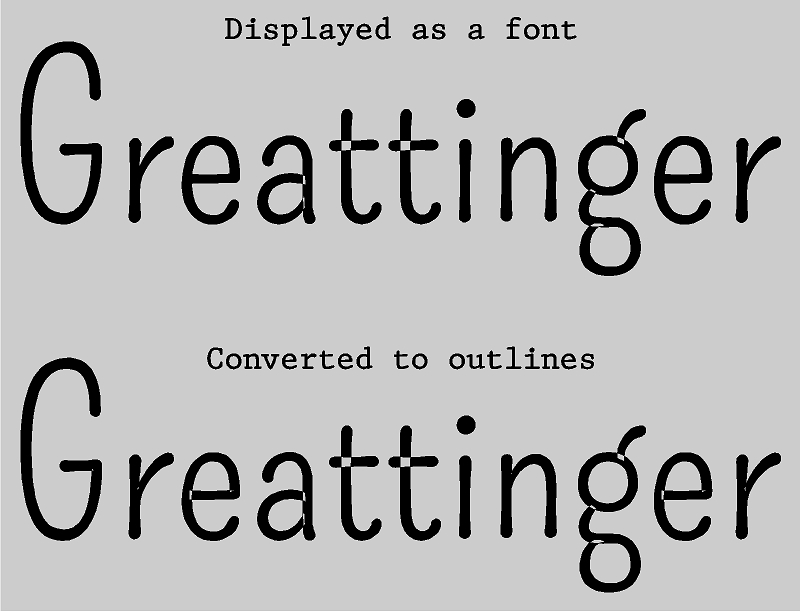
Every once in awhile I have a font that displays weird in Flexi. It looks as though the outlines overlap one another and that causes it to appear as a compound image, with holes in them. See the picture that show a preview of the font displayed as a font and as it is converted to outlines. Has anyone had this happen and is there a easy way to fix it without welding and then separating the weld and then deleting the pieces inside the letters? Thanks for input.
Font.jpg
 

bannertime

Active Member
I've seen it happen. I'm assuming that the strokes aren't welded or united so Flexi doesn't know what to do. If you uncompound, weld, and then recompound you could get it to work. Just make sure to not weld the inside of the letters.
 

Graphics2u

New Member
I've seen it happen. I'm assuming that the strokes aren't welded or united so Flexi doesn't know what to do. If you uncompound, weld, and then recompound you could get it to work. Just make sure to not weld the inside of the letters.
That's the process I use, and it works but it's just a pain when you have a large amount of text.

Or a bad free font?
The same font displays fine in other programs, So I think it's something to do with the way Flexi works
 

bannertime

Active Member
That's the process I use, and it works but it's just a pain when you have a large amount of text.


The same font displays fine in other programs, So I think it's something to do with the way Flexi works

Like I said, Flexi compounds it for some reason. It's a poorly made font that left a bunch of loose parts all over the place.
 

OADesign

New Member
Poorly designed font. I see this a lot, the more I visit dafont.com...
But I have had luck outlining in Illustrator, then bringing the vectors into Flexi. Or, after I get through cussing #@%^# the idea that someone would put out a lazily built font, I just go in and draw shapes to cover the holes/gaps and weld them all.

For me, its actually faster to draw in the gaps and weld than it is to cuss about it.
 
Last edited:

shoresigns

New Member
Overlaps are usually a sign of a poorly made font. Removing overlaps is normally an automated function that's done at the end of the font production process. So if overlaps haven't been removed, the font probably wasn't made by someone who knows what they're doing.

The exception is variable fonts, which do not normally have overlaps removed. This is done because removing overlaps will often result in a different number of vector points between the lighter and bolder weights of the same letter, thus making it impossible for the variable font to be interpolated.
 
Top