• I want to thank all the members that have upgraded your accounts. I truly appreciate your support of the site monetarily. Supporting the site keeps this site up and running as a lot of work daily goes on behind the scenes. Click to Support Signs101 ...

Work in progress...

Circleville Signs

New Member
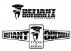
OK - working on a design ro a new tattoo shop here in town. What I have so far is two totally different directions - and I need some help in refining them down.

The client is not interested in "typical" tattoo shop stuff. He plans to grow this into a multiple location chain within 5 years and needs something that will stand out from the pack.

The top version I drew up working from a photograph. The second one is much simpler and more iconic, IMO - but I really like where the top one is going.

Thoughts?
 

Attachments

  • Logo-Concepts.png
    Logo-Concepts.png
    37 KB · Views: 151

Gino

Premium Subscriber
I like the top one also, but if the other one hadn't been underneath, I don't think I could've read the top one as quickly. I think you've obliterated the middles of the letters too much for them to stand up on their own.
 

JBusch260

New Member
I like the way the first one is going as well. Can you match the spray look that the text has, with the gorilla face shape? I think it would really tie them together.

The 2nd is iconic, and looks good, but it kind of reminds me more of a fitness place. I'm not feeling the opposing text perspectives though, to be honest.
 

rjssigns

Active Member
Both look good. When I do designs I always ask myself what will translate best to all other forms of media.
 

Fred Weiss

Merchant Member
Sorry, but I was immediately bothered by the use of the gorilla image with the spelling of "Guerilla" ... where an image of a beret wearing revolutionary fighter brandishing an AK-47 would seem more appropriate. Couple that with the difficult to read text and I'm thinking I may want to keep shopping for where to have my tat done.
 

Circleville Signs

New Member
Yes - I know that it isn't an ape. I had that discussion with the client. He likes the grammatical/visual dissonance. (don't ask me why...lol)
 

WildWestDesigns

Active Member
Sorry, but I was immediately bothered by the use of the gorilla image with the spelling of "Guerilla" ... where an image of a beret wearing revolutionary fighter brandishing an AK-47 would seem more appropriate. Couple that with the difficult to read text and I'm thinking I may want to keep shopping for where to have my tat done.

I just had a flashback of Captain Ron after reading that.
 

thinksigns

SnowFlake
Agree with the two different gorillas and "defiant" seems redundant with both of them.

That being said, you didn't come up with his name and you just have to make it work. I prefer the top one.
 

Moze

Precision Sign Services
I don't get why people do that. If a company name was 'My Three Sons Moving Co.', using three suns for the logo wouldn't make sense. I think it makes the business look unprofessional...possibly linguistically challenged. Not the look I'd want especially for a tattoo business. Again, not your problem - I just don't get people's reasoning.
 

Caitlin

New Member
Debate about "gorilla" vs "guerilla" aside, I like the top image but agree that the text is a bit too difficult to read at a glance.
Maybe the gorilla needs a beret :Big Laugh
 

John Butto

New Member
Sorry, but I was immediately bothered by the use of the gorilla image with the spelling of "Guerilla" ... where an image of a beret wearing revolutionary fighter brandishing an AK-47 would seem more appropriate. Couple that with the difficult to read text and I'm thinking I may want to keep shopping for where to have my tat done.
I am not a good speller, so I did not notice the Guerilla being misspelled. Has there been a survey of people who get tats being good spellers. But Fred since you brought up the spelling, "have my tat done." is not grammatically correct.
On the logo, I like them both, and even if you combined them together would be a good route.
 

Matt-Tastic

New Member
The "Screaming Gorilla" in the top logo was the only part of either i really liked. It has a lot of pop, and would make good decals for sell as well. Get the lettering cleaned up, and you could be going somewhere.

PS: there are a lot of people that won't find his shop on a google search due to the unconventional spelling of gorilla (not incorrect, just not what you would think when you saw the logo). Perhaps a decline in clientele because they can't find him will persuade him to rename the shop.
 

Fred Weiss

Merchant Member
I am not a good speller, so I did not notice the Guerilla being misspelled. Has there been a survey of people who get tats being good spellers. But Fred since you brought up the spelling, "have my tat done." is not grammatically correct.
On the logo, I like them both, and even if you combined them together would be a good route.

Then what is John? One would have their nails done or their heart bypass operation done ... so why not their tattoo?

I do like Caitlin's idea though to tie the two together by making the gorilla look like a guerrilla. (BTW ... my spell checker says that guerilla should be spelled guerrilla.)
 
Top