Hello all,
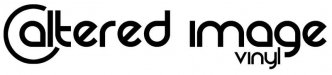
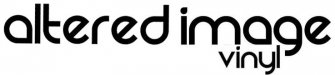
We currently have a logo that I like. But I use the word like loosely. I like it but dont love it. I think it could use some tweaking. Here are my areas of concern. The A in altered with the circle around it. The word vinyl is small and the letters are small. I know I could just increase the font size but then it seems to get out of proportion. We are doing our emblem on a lot of embroidery stuff and its a terrible design for embroidery due to font size and letters so close. Any one have any suggestions? I would love to hear them or even have someone redo it completely. Thanks in advance.
Wes