• I want to thank all the members that have upgraded your accounts. I truly appreciate your support of the site monetarily. Supporting the site keeps this site up and running as a lot of work daily goes on behind the scenes. Click to Support Signs101 ...

I'm Back

Can we get some of the big designers in here to comment?

well about the 'biggest' most respected designer on this forum asked you for some more detailed information but you pretty much disregarded him...but you just did a pretty good job of alienating everyone else who has tried to help you...
 

kapelskic

New Member
Oops

I have answered everybody's questions at some point in this forum. But for anyone who has missed the details, here it goes again.

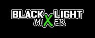
The attached design is just in the layout stage, I will be adding more color and effects in the next stage.
The design will eventually be a part of a flyer for a dance.
The dance is geared towards the college crowd
The music will be a wide variety but again think college party.
The purpose of the event is to bring a large group of people together for a dance, so they can have a fun time and meet other people, (Thus the mixer part).

That's about all the details I have, if there is something in particular someone would like to know and maybe i missed please let me know. I apologize to anyone who feels the same way as Dan. I am here to get help and make friends. So, as usual, Thank you to all of those that have commented up until now. I look forward to receiving more great advice!!

Chris

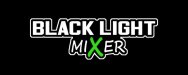
Oh and I attached another revision that I again updated on suggestions from the entire group. Do you guys like this one better? Thanks again everyone!!
 

Attachments

  • Blacklight_RevisedAgain.jpg
    Blacklight_RevisedAgain.jpg
    22.6 KB · Views: 127

J Hill Designs

New Member
try with blacklight as one word (drop the x so it doesnt intrude on blacklight) - make the X more of the same size as MI and ER and just use color to separate it instead of size, but it would still look good a bit larger, just not twice the size
 

Jillbeans

New Member
I repeat my earlier suggestions about the X.
There are big holes in that layout.
Try putting it all on one line, lose the whole X idea, and make Mixer in a script.
Not that I'm a big designer or anything.
 

kapelskic

New Member
Calm down please

No need for everyone to jump on me. Here is a revision more suited towards what you are suggesting. Am I right Jillbeans?
 

Attachments

  • Blacklight_Revised2.jpg
    Blacklight_Revised2.jpg
    21.4 KB · Views: 131

Jillbeans

New Member
It still has a huge hole in it (the X)
It seems also that you are relying on an outline to save the layout.
Here's a quickie suggestion.
I really wanted to add the dreaded white glow but I stopped myself.
Dan I will put away my fishing pole.
Rick I dunno if this is rave-ish or not but I know you'd know, you are not only The Circle Designer but also the Genre King.
 

Attachments

  • Graphic1.jpg
    Graphic1.jpg
    211 KB · Views: 121

kapelskic

New Member
Lol, Kwiksigns, I will add the rest of the flyer and design elements soon enough. Right now i am trying to get the logo laid out and such first before I crowd the design with the rest of the info. I see what your saying now Jillbeans. I wasn't relying on the outline to save the design, I liked it and no one suggested removing it that i remember off the top of my head.) Will take everything else into consideration. Anyone else care to throw their 2 cents in? Thanks again!
 

Rick

Certified Enneadecagon Designer
There are so many direction you can go, but "ravey" is not one of them. Most night club flyers are the played out booty clad 4-color and bling...>big yawn<

look at different styles... this is just a quickie idea, but thinking of club ala simple obeygiant logo
 

Attachments

  • blacklight.jpg
    blacklight.jpg
    131.1 KB · Views: 130

Mader Design

New Member
I'm liking the last one you posted up Rick. Great colors and the huge X works very well.

Just like someone else stated, it appears the direction of this project really hasn't changed from the first time I seen it. Just added the outline. I would lose the outline as it really isn't working.

Ricky has some great suggestions, I say listen up to everyone that has something useful to say and respond.
 

tcorn1965

New Member
As a non-designer. I really like what saktrnch's did. It caught my attention, and I would probably go just because of that. When it all boils down, it is what catches the attention of the the consumer...Right?
 

Mader Design

New Member
tcorn, just because it catches your eye doesn't mean it's going to have positive effect. Sometimes that can backfire and be harmful. saktrnch's design doesn't help, in fact it's a step backwards. Appears that it could have been created in Microsoft Word. We're looking for something that looks professional, yet fits the theme.

Rick's designs are what kapelski should be shooting for.
 

OldPaint

New Member
Back on the farm you used to manually masturbate caged animals for artificial insemination.
back on that same farm, plumber boy, we DID BREED HORSES....and they had a horse there that would be just like you. we called it a "teaser". you bring this ugly horse in to get the philly stired up, she kicks him a few times, then we remove the "teaser" and brought in the $25,000.00 STUD HORSE. you can google this if you dont belive me.
horses, trotters/pacers, ADIOS, and all he sired, from MILLER STABLES, WASHINGTON PA. BRET HANOVER, of HANOVER FARMS PA. was also at the farm i worked on.
 

Pat Whatley

New Member
Kwiksigns, that flyer makes no sense. The party is from 9pm - 8am...then the afterparty is from 8am - 1am? Shouldn't that have been 8:00 am - 1:00 pm?

And sorry OP, I don't need any more details of the adventures of you and Trigger.
 
Top