-
I want to thank all the members that have upgraded your accounts. I truly appreciate your support of the site monetarily. Supporting the site keeps this site up and running as a lot of work daily goes on behind the scenes. Click to Support Signs101 ...
You are using an out of date browser. It may not display this or other websites correctly.
You should upgrade or use an alternative browser.
You should upgrade or use an alternative browser.
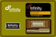
New Logo concept
- Thread starter Pinfinity
- Start date
Joe Diaz
New Member
I kind of think a script might look good for the main copy because when you think script you think one continuous line which would work with the name "infinity". Plus "infinity" is kind of a retro sounding name, to me anyway.
I drew this up and worked the infinity symbol into the lettering.

I drew this up and worked the infinity symbol into the lettering.
Deaton Design
New Member
Signmeup, your last version looks great. And Joes is equally great also and shows a whole other concept and way of approaching the design. Good stuff guys.")
SignManiac
New Member
 Joe that's an awesome design
Rick
Certified Enneadecagon Designer
I dig Joe's twist on it....
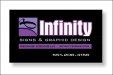
i thought I would throw out an idea... on the top, simple with a modern typeface, I have never like the infinity symbol, but I thought I would play with it.. the lower one is not dealing with any symbol... just a badge/crest enclosure.
both stay away from "sign guy" style typefaces.
i thought I would throw out an idea... on the top, simple with a modern typeface, I have never like the infinity symbol, but I thought I would play with it.. the lower one is not dealing with any symbol... just a badge/crest enclosure.
both stay away from "sign guy" style typefaces.
Attachments
rjpjr
New Member
...The colors go well, and I like how the avatar is two tones of purple.
Id ditch the oval, it doesnt seem like it belongs, but I really like the way it looks. Bold and at the same time, eye catchy.
I kinda agree. I like the colors ... except the purple outline around "Infinity". I would open it up a little and put an additional outline of black between the white and purple. I think it reads a little easier.
Joe's is kinda cool too!
Attachments

Pinfinity
New Member
Rick, your work is so unique! those cards you designed are so different..really nice. And your right, it appears I am truley a singuy by my use of font choices. Although, just getting back into the game, I'm making it a prority to update my font library. I think my work right now looks much like my hair looked in the avatar 80's-90's...right?
signmeup
New Member
I prefer the icon from post #1. I find it's too garish with the white. It just seems more upscale with the black infinity thing. The colours are too bright for my taste in 36. For some reason I hear Aqua's "Barbie girl" when I look at it. The design in post #1 is a bit more subdued without being dull. It just needed to lose the oval. I also find the phone number and info a bit lost down in the right corner like it doesn't know where it should go.(in #36) It's starting to crowd the edges a bit too. I think it looks better to leave a little more border space.


Rick
Certified Enneadecagon Designer
Rick, your work is so unique! those cards you designed are so different..really nice. And your right, it appears I am truley a singuy by my use of font choices. Although, just getting back into the game, I'm making it a prority to update my font library. I think my work right now looks much like my hair looked in the avatar 80's-90's...right?
The 80's you say.... quite a few of us had one. (this is me on too much Cure, Echo and the Bunnymen, Fun Boy 3, and Boones Farm....
Attachments

Pinfinity
New Member
signmeup...your spin looks and reads really nice. It's true less is more! is that copperplate you used for the secondary copy? I really appreciate your time and effort as well. I registered Infinity Signs & Graphics over 26 years ago. What do you think of the two color rectangle with the infinity icon?
Rick
Certified Enneadecagon Designer
Rick.....one word....Duuuuuuuuuuuuuuuude! looks like too much LSD 25! Would it be fair to say you were "not well!"
I thought you hessian dudes were not well... but we survived... well maybe not my liver...:ROFLMAO: