• I want to thank all the members that have upgraded your accounts. I truly appreciate your support of the site monetarily. Supporting the site keeps this site up and running as a lot of work daily goes on behind the scenes. Click to Support Signs101 ...

Opinions and critiques of design invited

signmeup

New Member
Here is a job I'm working on that I could use an opinion on. (I work in total isolation so there's no one to bounce ideas off here)

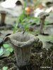
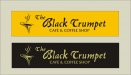
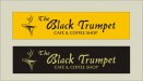
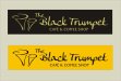
A little background might help. The design will be used for a large store front sign (16 feet-ish) and as a logo on menus etc. Not sure how the sign will be built but I'd like to do the letters in some sort of dimensional form....stuck on or set in....don't know. Also, I didn't know that a "black trumpet" was an exotic mushroom.......so there you go. The mushroom is an ugly sucker so I thought a rough looking lumpy font would be appropriate.

The owner is a trained chef.

Any preference on the colours and/or layouts, comments on font choices? Suggestions?

Forgot to mention...the building is the colour of the image background.
 

Attachments

  • BlackTrumpetSM.jpg
    BlackTrumpetSM.jpg
    59.2 KB · Views: 173
Last edited:

signmeup

New Member
Here's a pic of a black trumpet mushroom.
 

Attachments

  • peou_craterellus_cornucopioides.jpg
    peou_craterellus_cornucopioides.jpg
    22.4 KB · Views: 120

parkedcar

New Member
Bottom 2 for sure!
The top two the mushroom is a little confusing but the bottom 2, i like how you transformed it into a cup coffee. Portrays the name, and service nicely.
 

signmeup

New Member
Bottom 2 for sure!
The top two the mushroom is a little confusing but the bottom 2, i like how you transformed it into a cup coffee. Portrays the name, and service nicely.
Yeah....I like the coffee cup too but I can't get it to fit on the format of the sign how I'd like.
 

signmeup

New Member
How about the rough, lumpy font and the coffee 'shroom".

One other note...the guy mostly wants to sell food. Not sure why he has such emphasis on coffee. I ask him but he didn't really seem to know himself.
 

Attachments

  • BlackTrumpet2sm.jpg
    BlackTrumpet2sm.jpg
    38.6 KB · Views: 115
Very clean and readible, the only problem for ME is that in the top 2 the "T" is hard to distinguish. I didn't know what a black trumpet was, so before I read "the" with the same "t" in it, I thought maybe it was "Crumpet". I know anyone with a brain would figure it out rather quickly, but..ya know..
 

JR's

New Member
Hi Signmeup, just my opinion, make the colors more desirable for coffee shops and food. The yellow one can use imitation gold colors and the brown one needs more red in it. The logo / graphic if you can make it relate to the name or combine it some how I think that would look good. don't get me wrong thy look good but thy could look better.

JR
 

Dan Antonelli

New Member
Really don't like the typography. The layout is OK, but I think the icon would work better in print rather than an outdoor realm, as I think the viewer needs to work to hard to discern it at a distance. Wish the icon was bolder and more obvious to the reader, and the typography had more character to at connote some kind of feeling...
 

signmeup

New Member
Found another font I like and made the shrooms look more shroomy. Might have to modify the u a bit.
 

Attachments

  • BlackTrumpet4sm.jpg
    BlackTrumpet4sm.jpg
    45 KB · Views: 114

Dan Antonelli

New Member
The layout is good! That counts! This new typeface looks like a really bad auto-traced-scan-gone-awry. You have to have something better!

I guess not knowing what a black trumpet mushroom is, or what that has to do with a cafe/coffee shop is perhaps throwing me a bit.

Like, would you go to this cafe and get a mocha decaf and a plate full of black trumpet mushrooms (sorry, I don't drink coffee or eat mushrooms for that matter - so I'm serious!)

But the Friz Quadrate is VERY nice...
 

bob

It's better to have two hands than one glove.
Dubious type face selection for all of them. The lumpy ones on top will never do and the face used on the bottom two is discordant, It looks as if the upper case is from a different face than the lower. As well as being too light with way too much spacing.

And what is that thing over there on the left? A clogged funnel? The business end of a pilot relief tube? Perhaps you might try for the more obscure and go with a swan. As in black trumpeter swan. Whatever you use, make it part of the thing and not floating disembodied over there on the side.
 
Top