-
I want to thank all the members that have upgraded your accounts. I truly appreciate your support of the site monetarily. Supporting the site keeps this site up and running as a lot of work daily goes on behind the scenes. Click to Support Signs101 ...
You are using an out of date browser. It may not display this or other websites correctly.
You should upgrade or use an alternative browser.
You should upgrade or use an alternative browser.
Opinions and critiques of design invited
- Thread starter signmeup
- Start date
Rick
Certified Enneadecagon Designer
I think you need a stylized shroom, a realistic will still be lost or look like a flower or look plain ugly, it not the best looking schroom. Without knowing what the interior, exterior and food is, your ideas could be generic. I think knowing those things are important, otherwise we are looking at a decorative layout and not a logo at all.
signmeup
New Member
Thanks Rick.....I think you've got it pegged. I think the chef is counting on his customers knowing what a black trumpet is. I don't fall into the group he is trying to attract. I'm more the fish'n chips type when I go to a restaurant.
I'll pitch the stylized shrooms that I came up with. They look like the other companies you found but I did come up with it on my own. Time for the second meeting with Cheff before I go to any more effort.
I'll pitch the stylized shrooms that I came up with. They look like the other companies you found but I did come up with it on my own. Time for the second meeting with Cheff before I go to any more effort.
Dan Antonelli
New Member
Phil and Rick - really nice suggestions...
Jillbeans
New Member
I really like Rick's take because his mushrooms look whimsical.
I do not like your font choices, especially on the latter versions.
Here's my weak attempt at turning the mushroom into sort of a (sinister-looking) coffee cup.
Mine is a bit Halloweenical in coloring, I guess it's just that time of year!
As always, I revert to using Arthur Vanson's fonts because I love them.
I love bob's hippo comment too.

The script and the mushroom are supposed to be dimensional.
Love....Jill
I do not like your font choices, especially on the latter versions.
Here's my weak attempt at turning the mushroom into sort of a (sinister-looking) coffee cup.
Mine is a bit Halloweenical in coloring, I guess it's just that time of year!
As always, I revert to using Arthur Vanson's fonts because I love them.
I love bob's hippo comment too.
The script and the mushroom are supposed to be dimensional.
Love....Jill
Attachments
signmeup
New Member
Funny stuff bob... you're supposed to ingest the mushroom.Gag. all the more reason to use something else. Would you want to ingest anything prepared in a place named after something that looks like a hippopotamus's asshole?
Last edited:
signmeup
New Member
Very nice font Jill. I like the giant mushroom in the corner. I like how it's bigger than the sign. Gives me an idear....Thanks!
Ricks layout is very nice but the mushrooms look too much like wrought iron work and not like any sort of organic item. I think people would have even less luck figuring out that a black trumpet was a mushroom after seeing it. It would avoid the hassle of expaining to people what the weird things on the sign were all the time though.
Ricks layout is very nice but the mushrooms look too much like wrought iron work and not like any sort of organic item. I think people would have even less luck figuring out that a black trumpet was a mushroom after seeing it. It would avoid the hassle of expaining to people what the weird things on the sign were all the time though.
Marlene
New Member
is this mushroom something like Dulse where the locals will know what it is? if so, the double mushrooms looks nice. if not, maybe a little hint of something like grass or a log to show it is something growing. the rough font you started with way back in the first post isn't all that bad. I also like the skewed panel behind the mushroom that Tiki did.
signmeup
New Member
I've been thinking along the same lines Marlene. A bit of grass or something to make it more organic.... Jills goes there a bit.
The Black Trumpet is a delicasy like caviar or something as far as I can determine. Most of us don't know about it. It's snooty upper end stuff.
The rough, informal font goes with the rough texture of the shroom although, looking back, the original font is a bit too heavy for the weight of the icon.
Marlene
New Member
so it isn't a local thing that will be reconized. I would make it look like it is growing so those who don't know will get the idea that it is something to eat. people hate feeling stupid so if they mistake it for a musical instrument and then find out it is food, they will have some inner hostile feelings which is the last thing the business wants. it like not being able to pronounce a restaurant's name, it ticks people off even if they aren't aware of it.
signmeup
New Member
I think you may be right. Even bob didn't know what it was.Interesting name. I bet if you took a poll of the general population, <1% would know that a black trumpet is a type of mushroom.

Marlene
New Member
and he knows everything....I think you may be right. Even bob didn't know what it was.
signage
New Member

signmeup
New Member
That's why I've been trying for a some what organic look. I've been drawing a stylized version for budget reasons. I may offer to carve some realistic Black Trumpets out of HDU.so it isn't a local thing that will be reconized. I would make it look like it is growing so those who don't know will get the idea that it is something to eat. people hate feeling stupid so if they mistake it for a musical instrument and then find out it is food, they will have some inner hostile feelings which is the last thing the business wants. it like not being able to pronounce a restaurant's name, it ticks people off even if they aren't aware of it.
A highly stylized one like in Ricks layout avoids the whole issue though.
Jillbeans
New Member
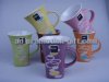
What about a highly stylized cup shape that was shiny black on a orangey oval background, offset, with gilded dimensional lettering on a darker brown background?
This pic is all I could find to describe what I was thinking.
But with your wonderful carving skills, I know you could make the actual mushrooms too.
I am with Marlene about not liking something that seems "over my head" but since almost everything is, I am used to it.

This pic is all I could find to describe what I was thinking.
But with your wonderful carving skills, I know you could make the actual mushrooms too.
I am with Marlene about not liking something that seems "over my head" but since almost everything is, I am used to it.