-
I want to thank all the members that have upgraded your accounts. I truly appreciate your support of the site monetarily. Supporting the site keeps this site up and running as a lot of work daily goes on behind the scenes. Click to Support Signs101 ...
Recent content by Artildawn
-

Looking for inspiration...
I think Gino's right, superscripting of the ordinal is more common.- Artildawn
- Post #19
- Forum: Designs & Layouts
-

Font ID request
@oldgoat...yeah, it didn't like my attachment so had to do a quick ftp upload @jhill... yep, that works. Thanks very much.- Artildawn
- Post #5
- Forum: Fonts and Typography
-
Font ID request
Looking for the name of font used for "lush" (it's actually part of Blush before anyone gets any ideas :P) Thanks in advance for your assistance.- Artildawn
- Thread
- Replies: 4
- Forum: Fonts and Typography
-
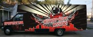
Shuttle Bus Wrap Opinions
the color scheme seems to belong to the "other team" rather than the one the mission represents. You should be able to do urban without going to a dark place. I like the gold instead of red suggestion but then you'll probably want to change the gradient in the rays too. Maybe sunset colors...- Artildawn
- Post #7
- Forum: Vehicle Wraps
-

-
Corel to Photoshop Layers
Jim, Just tested and it does work, but you'll have to plan in advance and set up the layers in Corel when you created the vector. -
got heat transfer vinyl but no idea what it is
is there no other identification other than the lot number? Nothing on the liner or in the core?- Artildawn
- Post #11
- Forum: Newbie Forum
-
Signs101 - Is it just me....
I haven't been on here much lately because of the same toxicity that others have already mention... and I wasn't on the receiving end before anyone asks. Now I just peek in occasionally to see what's new.- Artildawn
- Post #27
- Forum: General Signmaking Topics
-
usb not recognized
have you tried it using the rs323c port? also, if you haven't already... get the manuals here: http://www.graphtecamerica.com/support/ -
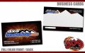
4x4ROCKSHOP.com Business Cards
nice, clean and simple. looks good.- Artildawn
- Post #5
- Forum: Designs & Layouts
-
Your design level...
I know enough to be dangerous. 20 years as a Navy Illustrator/Draftsman, all OJT (on the job training).- Artildawn
- Post #46
- Forum: General Chit-Chat
-
New Logo Critique please
Thin red on black will not be legible small or from a distance. The reversed text, while novel, makes the view work for comprehension. It took me a second to realize the S in the color block was a D. Of those presented, I'd lean toward the stuff in bottoms of columns 3 and 4, assuming the red on...- Artildawn
- Post #2
- Forum: Logo Design
-
-
wall art collection avaliable?
I don't know of any specific collections for walls, but there are tons of vector collections available although I'd doubt you'll find any with predesignated cut lines.- Artildawn
- Post #2
- Forum: Clipart, Vehicle Templates and Digital Files
-

parts service logo
The bottom left makes it look more like an Air Force star. The Bronze Star medal is actually two stars (see here:http://upload.wikimedia.org/wikipedia/commons/archive/7/72/20091002084159!Bronze_Star_medal.jpg) As an alternative to the star you could use the ribbon colors. I like the...- Artildawn
- Post #6
- Forum: Logo Design