-
I want to thank all the members that have upgraded your accounts. I truly appreciate your support of the site monetarily. Supporting the site keeps this site up and running as a lot of work daily goes on behind the scenes. Click to Support Signs101 ...
Search results
-
Client's email leaves me at a loss for words...
yes, drive it home with the word, but not the bold type I hope :omg: glad you can my suggestion. I think the reference to the value of a gift is ALWAYS critical, or you become partly responsible for devaluing your services... as Royster says, and you obviously know from experience... giving...- iSign
- Post #94
- Forum: General Chit-Chat
-
-
Client's email leaves me at a loss for words...
I think the latest is a winner. I too have difficulty not identifying where I've felt slighted in those worst of the worst transactions where the ball is in my court, but I just want to bean the F'n losers with it... so I've left a few jabs in my emails on a lot of such situations. Your re-write...- iSign
- Post #86
- Forum: General Chit-Chat
-

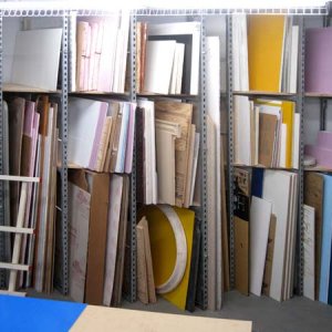
rackloaded
- iSign
- Media item
- Comments: 0
- Album: Member Album by iSign
-

substratecutoffs
- iSign
- Media item
- Comments: 0
- Album: Member Album by iSign
-

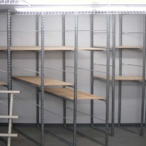
substrateshelves
- iSign
- Media item
- Comments: 0
- Album: Member Album by iSign
-
Intellectual Property and Copyright Theft In Our Industry.
first, I want to say this thread is great & I too would like to extend my appreciation to our capt design cop, because in this case I think he has done us all a service by helping get this conversation out in front of us with such a current & perfect example. That said, I guess I also owe him a...- iSign
- Post #45
- Forum: General Signmaking Topics
-
INK LAYERS in Flexi 8!!!!!!!!!!
I would do 2 layers & try 8 pass. No advice can take the place of running some test prints though. If you don't have some white plex & the means to simulate a light box, I suggest you get one. -
Client's email leaves me at a loss for words...
absolutely perfect!! nice, short, professional, & fair!- iSign
- Post #59
- Forum: General Chit-Chat
-
Client's email leaves me at a loss for words...
umm not in acrobat reader though... and not without correct fonts, and not at all if the designer doesn't want them too...- iSign
- Post #20
- Forum: General Chit-Chat
-
New Back-up Computer / year 1986
yeah & "electro-pouncing" too... who can forget following a wooden yardstick for a nice straight edge, and then running into that little metal end *ZAP!* that's one of those things you only do once.... I remember even taking some x & y move cheat sheets along with my resume on a sign job...- iSign
- Post #27
- Forum: General Chit-Chat
-
Client's email leaves me at a loss for words...
I'll start with the last question first.. ..do I provide native files, under what conditions and for what charge? Normally not, unless they've already paid for a logo & lost their copy, or they have become such a valuable client that I weigh the risk of losing work against the benefit of...- iSign
- Post #3
- Forum: General Chit-Chat
-
-
What Color To Paint My Shop
black, with red & yellow wave-like swooshies... or I know... ask ProWraps what color his shop is!- iSign
- Post #7
- Forum: General Chit-Chat
-
Call of Duty Wall Wrap
from one professional a$$hole to another... give it up.. you already know you look like a jackass, and we can all see you take pride in that... personally I've tried to chill on the jackass posts because nobody likes a jackass even if some of what you say has merit... Why not start your...- iSign
- Post #73
- Forum: Vehicle Wraps
-
seeking external lighting vendors? gooseneck or other exterior fixtures
I am trying to help a client with a proposal for dimensional letters that he can add some external lighting to. The landlord wanted channel letters, but will approve the non illuminated dimensional letters my client wants, if he adds external lettering. The lighting supply stores around here...- iSign
- Thread
- Replies: 7
- Forum: Dimensional Signs
-
-
PHP Help ?
I think you must have forgot the [/FUBAR] tag! :wink:- iSign
- Post #6
- Forum: Website Design
-
Design for a school that will be printed tomorow!!
dammit dude.. yiou da bomb!!! :thumb: I wanna be like you when I grow up... seriously that is the classiest way to tell someone what I find myself wantin' to tell a lotta guys around here lately... to the point, positive attitude... :clapping: I'm copy'n that one!! :notworthy:- iSign
- Post #31
- Forum: Portfolio Board
-

photo_proofs
- iSign
- Media item
- Comments: 0
- Album: Member Album by iSign
-
Design for a school that will be printed tomorow!!
I love the stock photos! The least authentic looking part of the whole thing is having 2 that are identical. I don't know their proximity to each other, but if you flipped one, that might look less obvious... or even a subtle resize, shear, distort or even color shift..- iSign
- Post #4
- Forum: Portfolio Board


