• I want to thank all the members that have upgraded your accounts. I truly appreciate your support of the site monetarily. Supporting the site keeps this site up and running as a lot of work daily goes on behind the scenes. Click to Support Signs101 ...

Alley Kat - help needed

aandrews19

New Member
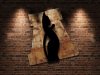
Local restaurant/ bar is planning on renovating and changing their overall look/ feel.... including their logo. It is a vary small place, that almost has a dive bar feel... but it is very contemporary. They are looking to change more towards the a rustic feel inside. The one thing they put an emphasis on was that they plan on bringing some brick in and doing 1 wall entirely in brick... to give it more of an 'Alley' look.

The 'Kat' part of the name comes from the owner's last name 'Kat-------', so they don't necessarily care if the logo includes a cat.

That is really all the direction I was given, and I'm really having a tough time coming up with ideas for this one. I jumped on illy quick and threw together some ideas based more around the text than anything. I figured I'd post here to see if anyone can help me find a good path to travel with this.
 

Attachments

  • AlleyKatlogo.jpg
    AlleyKatlogo.jpg
    76 KB · Views: 232

Craig Sjoquist

New Member
Your ideas are good, but not rustic ..ok
1st get a paper & pencil out start drawing. not illy that is why ya go after text 1st.

Just write the words out, several different ways, leaning towards something add a cat if ya like, think of a font ya have ok add that see how easy it is to come up with something.

Let it flow from you and your ideas, search the net, search bars, see if that changes things.

OK know ya got something ...now put it on Illy and start something with your ideas.
 

Jillbeans

New Member
Middle one...more space between the Alley and the Kat.
Maybe no cat in there at all, it really doesn't need to be that literal.
Love....Jill
 

vid

New Member
Middle.

I like the way you used the shape of the cat to define the right edge of the "Y". It does get lost though. More space.


Another idea is to silhouette the cat in the shape of the "A". It would conjure the idea of the cat sitting in an alley. The letter shape would define the perspective of the alley space.

I don't know why I chose to use Sofachrome for the attached idea. It's certainly not rustic, but it should give you an idea of the concept.​


Like Craig, I start with a pencil to get a better feel for the layout. I don't think it necessarily needs to be "rustic," but it should have some character. (I think the type first layout has that kind of feel.)

Anyway, that's my .o2. --- Good Luck!
 

Attachments

  • 101AlleyKat.jpg
    101AlleyKat.jpg
    4.5 KB · Views: 200

SignManiac

New Member
The problem I have with the middle design is it isn't rustic enough. Brick wall and I tend to visualize more of a graffiti style. A little rough around the edges.
 

aandrews19

New Member
I realize these ideas aren't exactly rustic. I was planning to achieve that with some tweaking to the ideas. I also realize starting with pencil/paper is the way to go, but seeing as this is going to be based more around the style font, it kind of speeds up the process to be able to just change the font with a few clicks, instead of redrawing again.

I was also thinking of trying the cat in the A, I'll give that a trying, and I'll play with some text ideas for #2. Might change the black box behind 'KAT' to look more like a brick wall.
 

Pat Whatley

New Member
Need an icon. I'm just picturing bar glasses, lampshades, and staff shirts with a simple icon instead of a whole logo. Throw a rusted steel A and a gloss black cat on the wall and ....okay, I'm going back to work now.

Just a rough idea.
 

Attachments

  • alley kat.jpg
    alley kat.jpg
    27.4 KB · Views: 240
  • ac.jpg
    ac.jpg
    113.6 KB · Views: 205
Last edited:

g&eprinting

New Member
Need an icon. I'm just picturing bar glasses, lampshades, and staff shirts with a simple icon instead of a whole logo. Throw a rusted steel A and a gloss black cat on the wall and ....okay, I'm going back to work now.

Just a rough idea.


That's nice
incorporate that in the middle one. whew game over.
 

lexsigns

New Member
:U Rock::thumb:
Need an icon. I'm just picturing bar glasses, lampshades, and staff shirts with a simple icon instead of a whole logo. Throw a rusted steel A and a gloss black cat on the wall and ....okay, I'm going back to work now.

Just a rough idea.
 

Moze

Precision Sign Services
Need an icon. I'm just picturing bar glasses, lampshades, and staff shirts with a simple icon instead of a whole logo. Throw a rusted steel A and a gloss black cat on the wall and ....okay, I'm going back to work now.

Just a rough idea.

That'd look good on some Cor-Ten or similar. Nice job.
 

Jillbeans

New Member
I love Pat's simple suggestion.
I'd run with it rather than adding clutter to the middle idea.
Which could still be put right beside the icon, sans kitty.
 

longlivemedia

New Member
But the background of "alley" is not in brick. But all the other elements were great. And I love how you placed the cat in the word art.
 
Top