• I want to thank all the members that have upgraded your accounts. I truly appreciate your support of the site monetarily. Supporting the site keeps this site up and running as a lot of work daily goes on behind the scenes. Click to Support Signs101 ...

Box Truck Wrap - New look!

TheSellOut

New Member
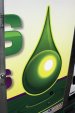
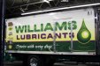
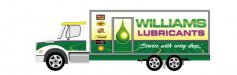
The top image is the original style that I have been doing for years for my client and the bottom is the new look that I designed and just recently installed. My client called and asked that I do a couple mocks to see what a full wrap could look like on the new trucks, for they wanted to try and achieve a three dimensional look while keeping the same overall brand appearance. Many layouts later the client liked my 1st attempt the best and I think it turned out great!

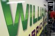
I have better quality pictures and close ups that I will be uploading when I have time to bring them in and downsize them for the site. We also video recorded the vinyl application on the side shown here and are working on a time lapse video too!

The layout was completely designed in Ai, saved as and .eps, and printed from VersaWorks to my Roland VP540i.

There are suttle effects such as drop shadows, inner glows, transparencies, and gradients that printed out great.

Look forward to your feedback...
 

Attachments

  • WL Truck2.jpg
    WL Truck2.jpg
    93.7 KB · Views: 128

MikePro

New Member
love the new look!:U Rock:
did you ever try to sell them on scaling their logo to avoid the door on the side? I've always hated how clients want their logo as big as possible, but ends up getting chopped up by an element on the vehicle.

clients always love it, but its always made me cringe when I see it!
 

TheSellOut

New Member
Mike I tried my best...We went through multiple layouts where I showed them many ways around the door and in the end...they still wanted it going through the door...
 

TheSellOut

New Member
Here are some better quality photos!
 

Attachments

  • WL Truck3.jpg
    WL Truck3.jpg
    273 KB · Views: 79
  • WL Truck4.JPG
    WL Truck4.JPG
    263.8 KB · Views: 87
  • WL Truck6.jpg
    WL Truck6.jpg
    65.3 KB · Views: 81

Craig Sjoquist

New Member
Great before and after, sure it would be great if the T & S ..shared the door better, but this is a great improvement, better use of branding colors, more readable copy, more balanced use of everything, and interesting improvements. The door rates low, besides you can paint it if needed
 

ForgeInc

New Member
Might just be me, but I could never let a wrap go like that no matter what the customer wanted. A letter totally obscured by moulding or hardware simply won't fly.
 

TheSellOut

New Member
Thanks for all the comments!

This is the layout that, as a professional, I insisted that they to use. It had all the elements they wanted at good sizes and it still had ties to the orginal layout. But still, in the end, the customer wouldn't have it any other way. So I guess what I am saying is that if the customer wanted it applied upside down, then you would all be flipping your monitors over to read it!

@ Forge, the work I have seen from you is outstanding and I value your opinion so don't take this as aggressive. What would you do? Turn away the customer because they ignore your advise? If so, would it matter that this is 1 of 3 box trucks they have to wrap? If not, how about if this client has a fleet of nearly 800 vehicles that you have had the account for for the past 4 years? If you are in a place where you could honestly turn away a customer like that...then I respect and envy you and I work hard everyday to get there!

@ JohnnySigns, this was my first box truck wrap and I just figured that those areas would have a greater chance of failure so I cut them out. Is it common practice to wrap the framing as suggested?
 

Attachments

  • WL Truck7.jpg
    WL Truck7.jpg
    27.3 KB · Views: 93

HulkSmash

New Member
Might just be me, but I could never let a wrap go like that no matter what the customer wanted. A letter totally obscured by moulding or hardware simply won't fly.

That's just ignorant. Sometimes the customers want what they want. And in this case it seems like the customer wanted the logo as big as possible. And even though the S is cut out a bit, i know exactly what it's saying.

Also, wrapping over the hinge looks nice and pretty, but most of the time since its open and cosed so much, it ends up popping up a few months down the road, so we rarely wrap over hinges like that. Just cut them out for less headaches, and a better quality wrap in the end IMHO. We've had people come to our place and have us re do wraps other companies have done, because all the hinges have popped up and ripped down the wrap.

Heath you did a good job, and in my opinion you did it the right way.
 

Jillbeans

New Member
Really wish they would have gone with your layout in post #17 as it's damn near perfect.
But it is a nice updated look.
Love.....Jill
 

ForgeInc

New Member
I guess what I meant to say didn't come off as intended. I'm not saying you shouldn't make your customer happy or do what they insist, what I AM saying, is maybe you can slightly tweak the overall size or layout so a letter isn't TOTALLY obscured and accomplish both goals. There are many subtle things you can do to work around mouldings like that, in some instances perhaps it's better to slightly adjust a letter one way or the other so it's not cut off. Maybe letters get cut or split in slightly different places so one isn't totally obscured. I don't think it's an either-or situation.

I might have suggested letter spacing similar to the top layout, with all the effects below the type of the bottom version. Do something like that, and you accomplish both.

Again, just my humble $.02 it looks like a mistake to me, but I am always reminded few people have the eye of us designers nor do they care! But if the customer is happy, in the end that's all that matters, for sure.
 
Top