GP
New Member
Try and make the "MINGLE GRAPHICS" a vibrant color so it draws focus and pops more in contrast to the greyscale background of words.
I agree - maybe red.
Keep at it - looking good.
GP
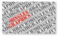
Try and make the "MINGLE GRAPHICS" a vibrant color so it draws focus and pops more in contrast to the greyscale background of words.
I'll try that too..I was thinking something like this...
I like the overall type treatment - maybe adjust the spacing a little to give it some breathing room.
I like the original concept too.. I think I'll play around with the all on one line.Now that I see it... I don't mind the stencil. Kinda "young" and edgy. I like the idea of a splash of red or chartreuse, like GP has. But I think the mingle and graphics should go on the same line like you have it with the cooper font.
edit: posted before I saw your new concept... I think I still like the original concept. This is all personal opinion. I'd like to see what Rick or Jillbeans thinks.
I like GP's... make the "S" at the end of MINGLE greyscale again, and see what you think
Our audience is more of a younger crowd.. but I'm also wanting something that appeals to an older crowd too.I like the new card as well, though it departs from young and edgy.
With a little work on font selection, it could work. Definitely cleaner and more professional.
Which direction better defines your brand/style? Who is your audience?
")