• I want to thank all the members that have upgraded your accounts. I truly appreciate your support of the site monetarily. Supporting the site keeps this site up and running as a lot of work daily goes on behind the scenes. Click to Support Signs101 ...

Critique requested

JTBoh

I sell signage and signage accessories.
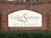
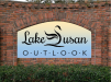
Trying to work around their awkwardly titled neighborhood.
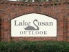
An "outlook" in Florida is anything over 25 feet above the surrounding terrain. Or at least they think so.

I saw a letter that looked like a bird, so I made it a bird. Ah, design.

Specifically, I'd like to keep the "S" in the bird, and everything else is fair play, including BG color. Customer is looking for a S/S (or like) cut letter.

The parts that I want advice or critique on are the fonts, and the body of the bird.
 

Attachments

  • Lake Susan.JPG
    Lake Susan.JPG
    145.6 KB · Views: 532

Gino

Premium Subscriber
The 'u' doesn't look like it's the same as the rest. The swan is floating (no pun) and doesn't seem connected either way. I also think the swan needs a bit of work. Also, the colors are too subtle.

The idea is good and you have a nice start. Just fix up a few things and I think you're on your way.
 

JTBoh

I sell signage and signage accessories.
You were right - I had the "u" at 80%.
Since it stainless, I'm thinking dark blue BG.
Worked the swan over, tweaked the sizes and layout.
I think it's there, but curious if anyone else has something to say.
 

Attachments

  • Lake Susan.JPG
    Lake Susan.JPG
    123.9 KB · Views: 467
C

ColoPrinthead

Guest
I would work on the bottom hook of the S if you are keeping the bird, maybe make it a little larger/wider.
 

unclebun

Active Member
And, per Gino's comment about the swan just floating in midair, some kind of line(s) to represent a water level would also keep the work OUTLOOK from looking like it's not part of the sign.
 

Gino

Premium Subscriber
I also don't like all caps with that font. The swan looks better, but it still needs more flowing feathers along with unc's waterline.
 
I'd use an actual swan silhouette and give everything a little more breathing room around the sign's perimeter as I've illustrated here. I like the use of the Tiffany font, my only gripe is I'm not sold on the k's with that little doohicky extending upward.
 

Attachments

  • Lake Susan.jpg
    Lake Susan.jpg
    478.4 KB · Views: 446
Last edited:

Billct2

Active Member
really rough, but I would work on the swan, taller, smoother & fuller. And consider other fonts for the bottom line of text
 

Attachments

  • 1b.jpg
    1b.jpg
    204.8 KB · Views: 443

Texas_Signmaker

Very Active Signmaker
I'd use an actual swan silhouette and give everything a little more breathing room around the sign's perimeter as I've illustrated here. I like the use of the Tiffany font, my only gripe is I'm not sold on the k's with that little doohicky extending upward.

I like your swan better, the other one tools like a serpent. I agree, not to keen on the front, the serifs are too big and the k is weird...
 

kcollinsdesign

Old member
Use an actual swan silhouette and have the bird floating on a line or reverse panel that separates "Lake Susan" from "OUTLOOK." Choose another font for "OUTLOOK" and fix the "u" in "Susan".
 

JTBoh

I sell signage and signage accessories.
Thanks for the input guys.
Unfortunately, I cant have to big a horizontal - its a curved wall - so waterline is out.
I tried to keep just the top contour of the swan in play, keeps it looking more like an "S" and less like a duck. The body is too much fill and off center for me.
I wireframed the S and put a swan's head behind it for the shape of the head, bill, and upper neck.

This is going to go before a committee anyway - love HOAs - so doing a quick and dirty using the last one I posted with a few tweaks.
If one of the 12x 68 year old retired people who will be having input on this yell at me about the feathers, I'll fix em lol.
I chopped the knob on the K's, just call me Lorena.
 

jman

New Member
Green and tan style sign you have is what I see alot of around here. The one with the actual swan silhouette is my favorite one.

I always wondered how sign guys get the inset shape just right on the sign.
 

yor

New Member
I think this swan design approaching would be a better solution in your case, since the resemblance to an S is more obvious.
You just have to take inspiration from this image to do something similar.
 

Attachments

  • 768d2c957d089d01b2075de2c90d41a2.jpg
    768d2c957d089d01b2075de2c90d41a2.jpg
    11.2 KB · Views: 382
Top