It doesn't have the best flow, but there are a few things you could do to improve this.
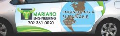
1: Like sardocs pointed out flip the globe around.
2: On the globe, keep the water blue like you have it but make the land green instead of brown to tie into the green color on the rest of the layout. That will help the flow a bit.
3: The text over top of the globe will be difficult to read from a distance. You want to avoid putting text over top of images like that. You have a few options here: Either place the text somewhere else or make the globe more subtle so the text has more contrast, (the green continents may help with that) .
4: The phone number either needs to be centered under the entire Mariano logo, or centered under the text. Right now its placement is a little awkward.
5: wrap the whole car, or lose the background imagery and just letter the vehicle and don't do a wrap. Because just doing the doors well make the vehicle look incomplete.
I like the Mariano logo though. But the rest of the layout needs some tweaking.
Thanks for the input.
Regarding #1, whoops...nothing else I can say about that one. LOL
Regarding #2, that's what they requested actually - they like the sepia look and wanted that brown to look like land masses or something; it used to be green, but they didn't like green.
Regarding #3, I'll work on changing the placement of the text.
Regarding #4, I agree, it looks akward. I was going to try to put an ellipse around it or something to give it some boundaries so it doesn't look like it's just floating in space and then center it under the entire logo. I'll see how that looks.
Regarding #5, wrapping the entire car is out of the question for them. The problem too is the logo itself, just the logo without a white background makes the logo not look right. It needs a white background to make it visible (in my opinion), I just don't think it would look right by itself on a silver background. Just doing the doors also makes it difficult to prevent it from doing just what you said, makes the wrap look incomplete, but they only want the doors wrapped unfortunately.
I really appreciate the input you've given. I'll work on this some more.