• I want to thank all the members that have upgraded your accounts. I truly appreciate your support of the site monetarily. Supporting the site keeps this site up and running as a lot of work daily goes on behind the scenes. Click to Support Signs101 ...

Farmers Market Logo

Stevealex

New Member
Hello All,

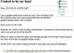
Our local newspaper recently Published a call to all artists to design a logo for the local farmers market that sets up here in town for about 5 or so months out of the year. Its a chance for individuals in the area to sale produce, and dairy goods to the rest of the community. The logo is to be simple and easy to use in the printing process. Here are my thoughts when I went to create it: As to the colors i Thought complimentery red and green would be a nice place to start. Also an earth tone type brown and finally a single stroke of yellow to break any possible monotony and add interest. In the city names themselves i added Produce elements such as the lemon in "globe" and the garnish element the M in "Miami", which i also feel offset any balance issues from the "heavier" looking 3 circles on the left. I tried to used the stylized strokes throughout the piece that only alluded to the objects with minimal brush strokes.

Any input or changes that you would like to share would be very appriciated. Thank you, Steve
 

Attachments

  • farmers market logo.jpg
    farmers market logo.jpg
    85.4 KB · Views: 147

HulkSmash

New Member
It's a good start. It seems like it's almost 3-4 logos in one...
Try to focus on which part of that logo you want to make the logo and
define that more. Too busy, and just not as good as it could be.
 

binki

New Member
Not really to the style of your design, just the portability to different applications:

One thing we run into a lot is someone with a fancy logo that they want embroidered on polo's or screen printed on t's. The number of colors as well as fine detail are often problems. At 4" are there any elements that are below .25 inches in any direction? If so then they will not be recognizable in sew files and may present a problem on screen printing on dark shirts.
 

Craig Sjoquist

New Member
Well right off the bat ... if you look at thumbnail chicken scratches
Ok so I open it up it looks like a girly restaurant sorta upscale looking.

A farmers market is BOLD, strong, colorful, readable, simple, and can be decorative

I think you got a good idea but needs some strength and a secure image.
 

Gino

Premium Subscriber
Nothing farmery looking about it.

  • I don’t understand the green dot.
  • Why are you using all caps with a type style that is meant for upper and lower case only ??
  • The swoosh should be in back of the rule, not in front.
  • Much too frilly looking.
  • The pictures don’t go with the types you’ve picked.
  • The colors have no continuity.
  • There seems to be no substance to your layout.
  • There is no flow to any of it.
I believe you should start over and get some uniformity involved with your words, pictures and colors.
 

jiarby

New Member
All caps on the farmers market text looks horrible, way over kerned for that font. Same thing in the Miami logo.

Are those the cities logos or did you make them too?

Is that the deathstar or half an orange in the Globe logo.

I like the basic idea/// 3 icons representing the farmers market, but the whole thing together looks like a kludge to me.

what is the point of that dot in the middle?

BTW...

Why are you working for free?
 

Stevealex

New Member
Globe and Miami are Adjacent cities. Seperate, but thought of as a collective community. so the dot was sort of a seperator. I do agree with the font in farmers market being overly kerned and the particular font was a bad choice for all caps. However I do think using all caps with wider kerning across the bottom is widely used and if executed correctly next time would still look good.

I actually would get some money for it, but either way i am interested in constantly growing and dont beleive its ever a waste of time to create as long as its a learning experience. I get paid well most of the time so i dont mind doing this in my spare time.

Thanks for your input on this logo. There was some constructive criticism on here that was useful and well phrased, and I will use this to recreate the logo and repost it.
 

ForgeInc

New Member
There's a lot wrong with this logo. First off, I think it is much too stretched out. I think you have something kinda happening with the 3 icons in circles (though they still need work) but then you have all this crazy type off to the side. Never, ever, EVER use fonts like that in all caps, looks horrible. I think you should re-start with your 3 circles, and build the logo around that in a more circular motif. But if I am to speak frankly, I think the logo in your avatar is even worse. Have you designed many logos for paying clients? Just curious....
 
J

john1

Guest
I think there is too much going on. To me, Globe and Miami seem to be logos in themselves so there is about 3 logo attempts going on it looks in one logo.

Check out and buy Dan Antonelli's books logo design and logo design 2. You can get them on amazing for about $50 for both. They are amazing.
 

Jillbeans

New Member
Farmer's market?
That doesn't have a farm feel at all, or an organic or food look.
The fonts are a mish mash of wedding invite looking weak decorative things.
Never use all caps in a display font.
That thing is a hot mess, there is nowhere for your eye to focus.
There are the three fruity looking cliparts on the one side, the dot, the wave thing over Miami.
The only thing worth salvaging is the word GLOBE, and that's only if you took the cutesy O treatment out of it.
I know I sound mean and not constructive, but that thing looks like someone who just got Word and figured out how to place clipart with it.
When you think of a farmer's market, well at least when I think of one, I think of colorful bright fresh produce and a homey kind of a feel.
Solid, old-fashioned lettering, tones of cream, reds, and greens.
Not that. Not anything about it.
Here's a really quick suggestion.
I don't have time to root around for veggie clip art so the circles are supposed to represent vegetables or produce.
Mine is no masterpiece either.
Love.....Jill
 

Attachments

  • Graphic1.jpg
    Graphic1.jpg
    236.1 KB · Views: 166

Stevealex

New Member
Lol, I get a kick out of the wolf-pack brutallity in some of these comments. And the redundency is even more hilarious. Please, if all the people before you said the same things, dont assume I will listen to your post more. I GET THE POINT!!!! And when did we revert back to 3rd grade and loose our sense of respect for the individual? I do respect criticism from those that are more experienced than me, but please refrain from the disgusted attitude towards People who have done it a fraction of the time that you have. It doesnt impress anybody.

I actually do really want to thank jillbeans though, because she took the time to actually Give a suggestion and I was actually really impressed with your portfollio so thank you jill.
 

JR's

New Member
hay Steve hang in there,
some times people are posting at the same time or thy read your post and nobody else post before thy post there thats. that why it seems like a gang.

JR
 

petesign

New Member
As usual, Jill I love your idea.

I immediately thought of a plowed field when I read farmers market. Just a little nudge if you want one.
 

Stevealex

New Member
Thanks JR. And i was thinkin of that too pete, i just thought it was a little overused. everytime i go to the canfood section or get some kind of farm-fresh food it seems like thats what you see on the product.
 

Gino

Premium Subscriber
Although you claimed to invite input and change, you had some reservations on how you were going to receive them evidently.

I would imagine Steve, once you're here for a while, you'll eventually see it's not some kind of wolf-pack mentality, but the kind of answers one gets when asking questions.... anywhere. Being polite has nothing to do with being honest. Regardless of their intent or your twist on things, all posts were pretty much spot on.

I believe what is more hilarious than your take on redundancy of answers.... is the redundancy of the same question from posters like yourself time after time after time again and again.

No one wants to take the time to research anything. It's a 'gimme-gimme' world and most people want their answers immediately. Seems as if no one wants to learn through proper channels, but rather dictate how they want help in their business or design studio and change the rules periodically to benefit themselves.

Now, I have a serious question for you, Steve. There are many Farmers' Markets in my area and I've been to some in other cities within 200 miles of where I live...... what kind of farmers' market has canned food ?? Other than some cans of imported stuff from Italy, Poland or some other country..... just about everything is wrapped right in front of your eyes or in jars. Sure, there's the occasional can of odds and ends on a shelf, but I don't think of a marketplace as having a canned food section. Perhaps, I'm just lucky where I live to have the real McCoy.

So, is this place a department or section in a grocery store... or an actual Farmers' Market' ??
 
Top