-
I want to thank all the members that have upgraded your accounts. I truly appreciate your support of the site monetarily. Supporting the site keeps this site up and running as a lot of work daily goes on behind the scenes. Click to Support Signs101 ...
You are using an out of date browser. It may not display this or other websites correctly.
You should upgrade or use an alternative browser.
You should upgrade or use an alternative browser.
First time poster prepared for the worst.
- Thread starter lukewarmtea
- Start date
Dave Drane
New Member
I like your attitude, Welcome from Down-Under! Good luck and take the advice offered. As Sigmaniac says a font can have real personality and it is annoying to see Times Roman on trade vehicles as likewise it looks stupid to see Gill Kayo etc. on a hairdressing salon.
lukewarmtea
New Member
Visual800 - Consensus is the bottom font is terrible, dang!
Pat White - I have spent quite a few hours on google images looking at logos and its easy to pick the ones that appeal to me, harder to explain why they do.
Just an update I have received my book from Mike Stevens and am in the process of reading through it. Here's hoping I absorb a bit from it.
Pat White - I have spent quite a few hours on google images looking at logos and its easy to pick the ones that appeal to me, harder to explain why they do.
Just an update I have received my book from Mike Stevens and am in the process of reading through it. Here's hoping I absorb a bit from it.
SignManiac
New Member
Your first post states you want to design a sign for your friend, yet you are attempting to design a logo of sorts? I would not focus on a logo at this time. It's a much harder task to create than it is to design a sign. Also, you still haven't stated what, how and where this sign is going to be used for your friend?
If it's only a sign then it would be pretty easy to attempt. I can think of dozen effective designs for this project. But keep reading the book and I bet you will come back with a better attempt once you begin to learn the hows and whys of design.
If it's only a sign then it would be pretty easy to attempt. I can think of dozen effective designs for this project. But keep reading the book and I bet you will come back with a better attempt once you begin to learn the hows and whys of design.
lukewarmtea
New Member
Sorry I should have clarified earlier and I think I posted this under the wrong forum it should be in design and layout not logos. I'm designing a sign for him to put on the front of his building, not necessarily a logo. I will post more ideas once I'm finished with the book for you guys to judge!
Jillbeans
New Member
While the script font can be OK on some retro signs, it reads as f*cking to me.
Try it for the name, kerned tighter, and use a simple font like Impact for the trucking part.
Yours looks kind of MS Paint-y to me.
Glad you got the Mike Stevens book.
Here's a quick suggestion.
Love....Jill
Try it for the name, kerned tighter, and use a simple font like Impact for the trucking part.
Yours looks kind of MS Paint-y to me.
Glad you got the Mike Stevens book.
Here's a quick suggestion.
Love....Jill
Attachments

lukewarmtea
New Member
Revisions
As I read this book I'm going to post updated examples trying to implement the theories as I learn them.
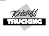
In this example the spacing is better I hope. The proportions between the upper/lower and side boundaries should be close to right. The bottom word was capitalized to create a smooth line for the bottom of the top letters and therefore reduce "negative space discordance". I kerned the words a bit too, hopefully reducing confusion between the letters and the background. I also don't believe any of the letters contain too much trapped negative space.
Any thoughts, did I kern too much, is my spacing off? Sorry about the font, I only chose it because he uses it on his truck door decals.
As I read this book I'm going to post updated examples trying to implement the theories as I learn them.
In this example the spacing is better I hope. The proportions between the upper/lower and side boundaries should be close to right. The bottom word was capitalized to create a smooth line for the bottom of the top letters and therefore reduce "negative space discordance". I kerned the words a bit too, hopefully reducing confusion between the letters and the background. I also don't believe any of the letters contain too much trapped negative space.
Any thoughts, did I kern too much, is my spacing off? Sorry about the font, I only chose it because he uses it on his truck door decals.
lukewarmtea
New Member

lukewarmtea
New Member
Very nice Jill!
My explanation for the poor color quality is I'm designing these demos in a vector program and flood filling them with a paint can. Ultimately I will be routing out the sign on a CNC machine so image/color quality isn't my primary concern. At this point I don't know any better Maybe I should be using different software!
My explanation for the poor color quality is I'm designing these demos in a vector program and flood filling them with a paint can. Ultimately I will be routing out the sign on a CNC machine so image/color quality isn't my primary concern. At this point I don't know any better
Maybe I should be using different software!lukewarmtea
New Member
A question I have is it okay for my exact optical center to be between the two words? It seems to keep my formatting right my optical center is pretty much negative space?
lukewarmtea
New Member
One last question of comment on my latest design is the bottom word has a bit more spacing between the letters, therefore a bit more negative space. This makes it somewhat harder to read, monotonous, whatever you want to call it, but ultimately it directs your attention to Kristoff at the top. At least this was my intent, opinions?
Dave Drane
New Member
What word do you think should be more important to read?? "Kristoff" or "Trucking"??
What do you think would be more important to potential customers?
What do you think would be more important to potential customers?
Dave Drane
New Member
lukewarmtea
New Member

lukewarmtea
New Member
Neat idea with the tilted box Dave. Hey what fonts are those? I'm not sure if this book explicitly lists the proper fonts yet, I think it's orientated toward people hand painting more rather than myself with a font browser.
If you guys don't mind me asking what is a good go-to font for industrial business type signs? Helvatica? San Serif? Rockwell?
If you guys don't mind me asking what is a good go-to font for industrial business type signs? Helvatica? San Serif? Rockwell?
lukewarmtea
New Member
Dave in your example did you angle the scripted text? I'm trying a version with the top being scripted and am having issues with the bottom of the lower case f's interfering with the text below it.
")
lukewarmtea
New Member
Got it! Thanks Jill