-
I want to thank all the members that have upgraded your accounts. I truly appreciate your support of the site monetarily. Supporting the site keeps this site up and running as a lot of work daily goes on behind the scenes. Click to Support Signs101 ...
You are using an out of date browser. It may not display this or other websites correctly.
You should upgrade or use an alternative browser.
You should upgrade or use an alternative browser.
For critique
- Thread starter Pete Moss
- Start date

SignManiac
New Member
Your best effort to date,
And now we have this...
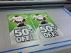
Looks great! Is there any chance you could lay a light grey shape behind your text as if its creating depth of the snowbank? It would go a long way towards defining your text better and add a little more interest.
Jillbeans
New Member
Layout is better (better prioritization of copy) but I really dislike the fonts (I never did like the 50% off one because it reminds me of Arial) and it would look better with a black outline on the copy. Or just make the the lettering in red...you can get away with it on the white.
...by the time you finish this, Christmas is gonna be over.
...by the time you finish this, Christmas is gonna be over.
rjpjr
New Member

Pete Moss
New Member
As in bubble out the text in a grey shape, leaving the text on top? Or like a rectangular shape? Or other shaped back drop, like a snowflake?Looks great! Is there any chance you could lay a light grey shape behind your text as if its creating depth of the snowbank? It would go a long way towards defining your text better and add a little more interest.
Last edited:
Marlene
New Member
I should also add...This design approach would appeal more to the women who do the majority of shopping during the holidays so this is designed from a psychological and subliminal perspective. Guys will wait until the last second to go shopping. Plus.... a woman see the word sale and that's the push over the edge")
how does a woman Santa appeal to women? a Santa that looks like Chris Hemsworth would appeal to women but a chick, not. we women sure do get giddy over the word "sale" and will throw down our aprons to run off the store.
Pete Moss
New Member
Hmm, I like the font. Although I see what you mean with the 50% part. The design is down to one font now. I thought the font is nice and bold, legible and with a little variation. I'd love for you to suggest a free font. I am already waaaaaaay over time of what I am going to charge the client so I can't see purchasing a font for this job. It's a good thing though I decided from the beginning of this job that I wanted to get as much from this thread as I could.I am glad to hear that everyone is liking the progress.Layout is better (better prioritization of copy) but I really dislike the fonts (I never did like the 50% off one because it reminds me of Arial) and it would look better with a black outline on the copy. Or just make the the lettering in red...you can get away with it on the white....by the time you finish this, Christmas is gonna be over.
Marlene
New Member
Hmm, I like the font. Although I see what you mean with the 50% part. The design is down to one font now. I thought the font is nice and bold, legible and with a little variation. I'd love for you to suggest a free font. I am already waaaaaaay over time of what I am going to charge the client so I can't see purchasing a font for this job. It's a good thing though I decided from the beginning of this job that I wanted to get as much from this thread as I could.I am glad to hear that everyone is liking the progress.
the font looks OK to me. I can read it at thumbnail size, it isn't overly done or too plain. I think it works as is.
qmr55
New Member
Huge improvement, looks stellar!
As it stands the design will looks great and be effective, but the below is definitely not a bad idea.
As it stands the design will looks great and be effective, but the below is definitely not a bad idea.
Looks great! Is there any chance you could lay a light grey shape behind your text as if its creating depth of the snowbank? It would go a long way towards defining your text better and add a little more interest.
shoresigns
New Member
Outlines and shadows on the text is too much. Tone down the shadows (make them subtler) or try removing them altogether.
Either way, whether it's font change or adding the shape, I am going to button this one up by end of day today. I'm still not exactly sure what Tim is asking for. I'm guessing a light grey box around the text and behind Santa? It's been a good thread, thanks again everyone.
I just meant to add some depth to your snowbank kind of like this then lay that crisp, bold text over it and it will jump off the page.

Pete Moss
New Member
I just meant to add some depth to your snowbank kind of like this then lay that crisp, bold text over it and it will jump off the page.
View attachment 103299
Got it.

Pete Moss
New Member
After looking at them side by side I decided that I like the original better..................................HA! Just kidding. I am happy with it, she loves it. I let her know that the extra time was my Christmas present to her. Completely worth it, she gives me tons of work and is easy to work with. Tomorrow it will be printed.