-
I want to thank all the members that have upgraded your accounts. I truly appreciate your support of the site monetarily. Supporting the site keeps this site up and running as a lot of work daily goes on behind the scenes. Click to Support Signs101 ...
You are using an out of date browser. It may not display this or other websites correctly.
You should upgrade or use an alternative browser.
You should upgrade or use an alternative browser.
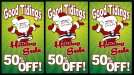
For critique
- Thread starter Pete Moss
- Start date
thinksigns
SnowFlake
I would remove Good Tidings and move Holiday Sale to the top.
Pixels Are Bad Mmmkay?
New Member
The middle one gives a slight feeling of depth, so that would be my preference. 50% OFF is easily readable from the thumbnail, so I think it's very effective.

BIG EASY DOES IT
New Member
Middle one also. I was also thinking maybe the holiday sale should be a little larger
Pete Moss
New Member
Thanks for input!
The middle one was my choice until my wife's critique. She has a bachelors in art, I listen closely to her suggestions. She thinks the readability of "Good Tidings" was adversely affected.
Getting rid of the "Good Tidings" text or at least making "Holiday Sale" larger is what I'll play with next. Thanks!
The customer wanted it to read "Total Clearance" which to me screams closing (which she is not) I changed the text to good tidings in it's place. She also wanted 50% off as the focal point. No one has an issue with the Holiday Sale readability? One of my concerns that I was mulling over.
Marlene
New Member
I would remove Good Tidings and move Holiday Sale to the top.
agree best to get rid of extra copy when you can so it just reads Holiday Sale and 50% off
BIG EASY DOES IT
New Member
Thanks for input!
The middle one was my choice until my wife's critique. She has a bachelors in art, I listen closely to her suggestions. She thinks the readability of "Good Tidings" was adversely affected.
The customer wanted it to read "Total Clearance" which to me screams closing (which she is not) I changed the text to good tidings in it's place. She also wanted 50% off as the focal point. No one has an issue with the Holiday Sale readability? One of my concerns that I was mulling over.
That' why I said maybe a little larger for that. Total Clearance is that the sequel to total recall?>
Gino
Premium Subscriber
Thanks for input!
The middle one was my choice until my wife's critique. She has a bachelors in art, I listen closely to her suggestions. She thinks the readability of "Good Tidings" was adversely affected.
The customer wanted it to read "Total Clearance" which to me screams closing (which she is not) I changed the text to good tidings in it's place. She also wanted 50% off as the focal point. No one has an issue with the Holiday Sale readability? One of my concerns that I was mulling over.
Wifey is always a good thing to listen to.
If the customer wants 'totally', you can achieve that with keeping all of your elements right where they are, but reduce the size of 'Holiday Sale'. The only important thing on there which people need to read is 50% OFF. The rest is all gingerbread and window dressing. Now, by adding the word 'Everything' just above that, you'll get both messages across.
A simple lesson here....... Here's what you have :
The Santa Claus which tells everyone something is happening why, where and when. The 50% OFF is what they are selling. That's the meat and potatoes of your sign. All the rest is the dressing. It just makes the sign likable, sweet, adorable, festive and the list goes on. It serves one purpose, to make someone look at it and take notice. If someone happens to read it, fine, but it's not important, not at all.
You've addressed it all, quite well. 
shoresigns
New Member
I agree with your wife's comments on the middle one - the character overlapping on the text does hinder the readability. I would definitely go with the left one. Also "Good Tidings" is stretched a bit too tall.
rjpjr
New Member
Yes, I do!No one has an issue with the Holiday Sale readability?

Looking only at your thumbnail, Holiday Sale doesn't exist.
Not only is Holiday Sale lost, I can't see Santa is a Santa.
Just about everything is lost except 50% OFF.
As you have mentioned, if you have the opportunity to remove Good Tidings, I would. It isn't necessary in my opinion.
I might do something like this...
Attachments


Jillbeans
New Member
I like the last suggestion.
On your original, I prefer the center version, but make Holiday Sale in white. Writing it in red gives it zero contrast.
I prefer the retro looking script for Holiday Sale. Has a nice window splashy feel.
If it's in a real nice mall, I'd use the Holiday Sale in the clean sans serif as above.
Love....Jill
Pete Moss
New Member
Thanks again for all the input folks! Keeping in mind all that's been said I have a few more... I really like the present looking sign, it would be a creative placement for banner text on the ribbon.
I had to add an extra drop shadow for the white to contrast more in 3 & 4. The stretch on the "good tidings" text I felt was probably okay since it was warped anyway and seemed to fill the space nicely. Having said that, it is another thing I was on the fence with. I am going to fix some kerning issues in that text.
I ran into the director of the graphics program from school the other day. She is now the art director for one of our larger clients. We reflected on school and had some good graphics talks. She made a point of saying how important it is to keep things simple. Due to this I have not added any more to the graphic. I see the point, however wouldn't some magic Santa sparkle dust look cool emanating from his mittens to the outside of the "good tidings" text?
Please excuse any typos, only half way through my first cup of coffee.
Attachments


Gino
Premium Subscriber
I still like the original middle one the most. While these last ones are still good, to me they are getting too involved with effects and balance. They now are what I call 'bottom heavy'. Sometimes, over the king something lEads you acknowledge to square one, which ain't a thing, in this case.
Pete Moss
New Member
Yeah, I was planning on tightening it all up making the margins balanced. I still like Santa over the top text to add depth. I also like giving reason for the sale. The idea is to send a message of good will, tis' the season and all of that happy stuff. I'll present two versions to the customer. She is one of a handful of freelance customers I have. The actual I/O paper for her sandwich sign will be printed here at my 9-5 job. All of my freelance customers follow my advice, either way. It's nice like that. Once the two are finalized I'll clean them up and bring up the remaining issues I've been somewhat on the fence with, that have not yet come up. Of course I'll post the finalized versions too.
Last edited: