-
I want to thank all the members that have upgraded your accounts. I truly appreciate your support of the site monetarily. Supporting the site keeps this site up and running as a lot of work daily goes on behind the scenes. Click to Support Signs101 ...
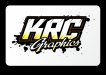
give feed back on new logo
- Thread starter KRC SAFETY CO
- Start date

")
ScrapWrapper
New Member
Great start, Id try to make the graphics a little more readable.
KRC SAFETY CO
New Member

SignManiac
New Member
You already have a somewhat complex logo with the font choices you've made and with all the added effects, you only make it that much more difficult to read. Just looking at your smaller thumbnail, it's hard to easily make out the word Graphics. Less is more. Don't get so caught up in the bells and whistles when a blind man can't use his ears to see.
Flame
New Member
Not a bad start bro. Might just want to tweak some things. No clue what your fonts are but here's a quicky example of mine. Adjust border thickness a bit, improve contrast, maybe use colors as just compliments to a firm black and white combo?
Ideas...
Ideas...
Attachments
Flame
New Member
what font collection is that out of Flame?
Top is custom, bottom is Red Sable. Letterhead Font.
KRC SAFETY CO
New Member
So wait..Your a construction company or "safety" company opening a graphics business?
Your logo looks great!
Yes we are a traffic control company that has a sign shop doing just traffic control signs. now we are going to be opening a sign shop for all types of signage, wraps, design
KRC SAFETY CO
New Member
thanks for all the advise. im tweaking and playing around with it and will put up some more
thanks again
thanks again
C
ColoPrinthead
Guest
I like the top but think "graphics" should be easier to read. Thank you for spelling graphics properly, the gaffx/grafix/graphix stuff annoys the hell out of me.
qmr55
New Member
Passable if you were opening a tattoo parlor, dreadful for a sign shop. Try again.
+1
TyrantDesigner
Art! Hot and fresh.
Follow flames suggestion as a starting point.
Cutting the bottom 1/3 of your 'KRC' off with a hard to read script with a drop shadow on it is a bad design decision. Just because you can add an effect to a graphics shop logo ... doesn't mean you should.
That being said, start over, design your logo in black and white (it will help your brain process design easier) and make the logo work without cheap effects like drop shadows ... because afterall, you put that on each side of a vehicle ... your lightsource won't be coming from the front on the driver side ... I can't describe how much that irks me ... it's like having an arrow in the logo that goes from left to right on both sides ... one side it points at the back bumper, the other at the front bumper. Makes for sloppy design work. And change the 'graphics' font, it looks like a freshman college kids attempt at a 'SICK FONT' for his typography class.
Rick
Certified Enneadecagon Designer
I dig Flames ink splat top copy...
You have so many opportunities here, you should have ideas all over the place and this would be low on the list if you really give more effort on other concepts. The "Graphics" copy is too hard to read...
I would set this aside for now and come up with some fresh ideas. I think 10-20 rough ideas is very possible and then whittle them down and develop the stronger ideas from there.