• I want to thank all the members that have upgraded your accounts. I truly appreciate your support of the site monetarily. Supporting the site keeps this site up and running as a lot of work daily goes on behind the scenes. Click to Support Signs101 ...

Happens too often...

DesireeM

New Member
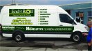
I like when others post examples of their work so here goes....the first photo is of the wrap I designed originally (simple and bright) and then what he actually went with after lots of revisions and despite my very logical reasoning against using his van as a brochure.
 

Attachments

  • PassengerSide mockup.jpg
    PassengerSide mockup.jpg
    52.9 KB · Views: 74
  • PassengerSide Mockup_rev.jpg
    PassengerSide Mockup_rev.jpg
    581.3 KB · Views: 105

GaSouthpaw

Profane and profane accessories.
Makes you want to smack 'em, doesn't it? Too bad people so often ignore the experts.
Nice work on the proposed one.
(Also, damn you, Daimler, for putting that ginormous black line down those things!)
 

DesireeM

New Member
Makes you want to smack 'em, doesn't it? Too bad people so often ignore the experts.
Nice work on the proposed one.
(Also, damn you, Daimler, for putting that ginormous black line down those things!)

Thank you and I know! Gotta love designing around those big industrial eye-sores.

You win some, you lose some. Good on you for at least trying to pretty up Ontario's armpit!

Omg I almost choked on my lunch on that one! hahaha I've never heard Sudbury referred to as Ontario's armpit but I asked a co worker and he said that the full saying is "Sudbury is Ontario's armpit but Hamilton is its a**hole." I guess I'm too young to understand the reference...lol
 

genericname

New Member
Omg I almost choked on my lunch on that one! hahaha I've never heard Sudbury referred to as Ontario's armpit but I asked a co worker and he said that the full saying is "Sudbury is Ontario's armpit but Hamilton is its a**hole." I guess I'm too young to understand the reference...lol


He is not wrong. I spent a few years in Sudbury, and I have a lot of family there. Grew up in Timmins though, where the saying was well known. Still, we're a self-deprecative bunch, so we usually worked in a line about Timmins being the groin or something.
 

Locals Find!

New Member
Besides the logo looking bad on the 2nd one. The 2nd design is much better. It is clean easy to read and get the message across. The first design looked cluttered, busy and had way too much white space.
 
Last edited:

DesireeM

New Member
He is not wrong. I spent a few years in Sudbury, and I have a lot of family there. Grew up in Timmins though, where the saying was well known. Still, we're a self-deprecative bunch, so we usually worked in a line about Timmins being the groin or something.

I hear the self-deprecating part for sure! I was born in Timmins, grew up in Cornwall and moved to Sudbury roughly ten years ago. So if Sudbury is the armpit I'm guessing Cornwall is more likely the a**hole...you know, because of the smell lol.
 

ddubia

New Member
That went from attention getting with a lot of pop to, 'I ain't gonna read all that'.

It does happen all too often.
 

genericname

New Member
Besides the logo looking bad on the 2nd one. The 2nd design is much better. It is clean easy to read and get the message across. The first design looked cluttered, busy and had way too much white space.

Just cause you slapped a garbage background on a van doesn't make it a good design.

Are we even looking at the same designs? The second one is a bloody text book.
 

DesireeM

New Member
Besides the logo looking bad on the 2nd one. The 2nd design is much better. It is clean easy to read and get the message across. The first design looked cluttered, busy and had way too much white space.

Just cause you slapped a garbage background on a van doesn't make it a good design.

Duly noted however there's no need for the nasty tone... You speak as though I've offended you somehow.

The first pic is a first draft design to get a feel for the customer's tastes....it was by no means a final draft. All I had at the time was his logo and phone number and that he wanted somethign bright and bold. I guess I could have slapped them on a solid colored background or maybe a photo of clouds if you'd prefer..... And there's so much white space because he originally only wanted a 1/2 wrap.

I'm sorry you think the background is garbage seeing as I designed it from scratch but I guess that's just a matter of opinion.
 

Gino

Premium Subscriber
While your layout was far better, it still had a bad flow and continuity to it. You might've been able to pull it together more with one or two of his final elements, but I still feel for you..... having to put the Bible on the side of a truck.

Next time, just kick 'em in the seat and tell 'em to get outta your shop. :Big Laugh
 

DesireeM

New Member
While your layout was far better, it still had a bad flow and continuity to it. You might've been able to pull it together more with one or two of his final elements, but I still feel for you..... having to put the Bible on the side of a truck.

Next time, just kick 'em in the seat and tell 'em to get outta your shop. :Big Laugh

Can't argue with you there - like I said it was just a first draft that would have been refined had he liked the direction I was going.

Oh how I wish Signs101 had a "Like" button so I could simply concur to a well said reply like this without all the work.
 

Joe Diaz

New Member
I feel for you. I've been trying to master the art of convincing difficult clients that our good design decisions were actually their idea. It works most of the time, but every once in a while you just cannot win.
 

TammieH

New Member
Yeah, that sucks, your original layout is so much better than when your customer gave his 2 cents....I feel for you

Sometimes all you can do is shake your head, and disown the finished product, haha!
 

JBusch260

New Member
I'm sorry you think the background is garbage seeing as I designed it from scratch but I guess that's just a matter of opinion.

I think your first design, including your background design was fine. It was a little busy, but it fit the overall theme of your layout. AND it was worlds better than the customer's choice. Use your background for an upcoming customer that has a better sense of style. ;)
 

Stanton

New Member
Sometimes all you can do is shake your head, and disown the finished product, haha!

:Big Laugh

When a client gets too involved in my design,
I'll put 'staff' of 'customer' in the Designed By: box
in the title block.

(instead of hitting the delete key and going home.)
 
Top