ams
New Member
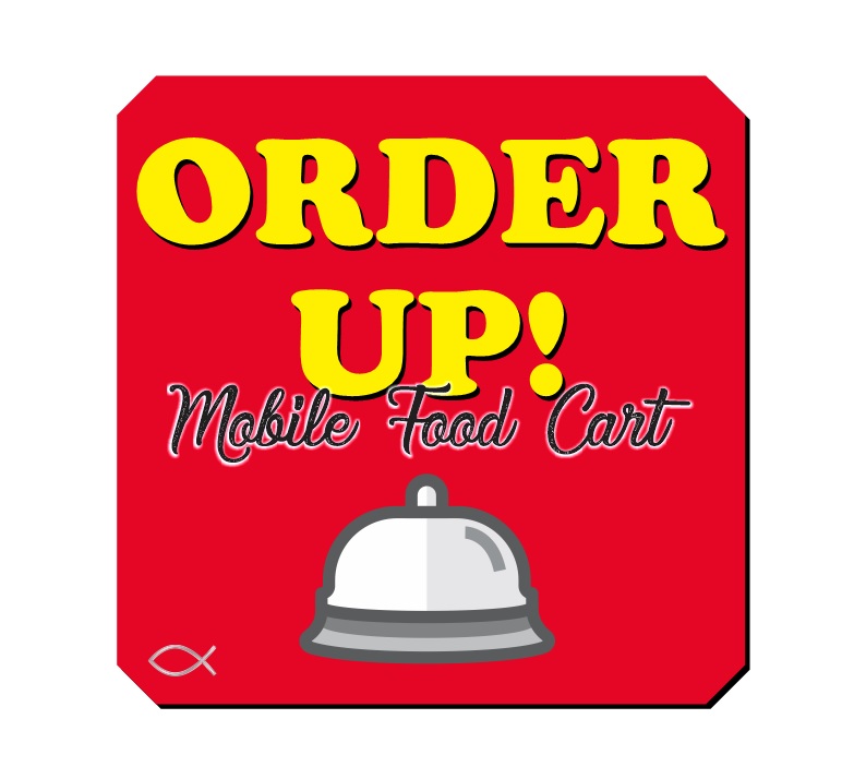
I designed this logo for a customer (they wanted a simple kids like bell, it's ugly.) Overlapped black letters on the yellow, which was impossible to read so I added a white outline, etc.
Well she says it's not what she wants, she wants it more "contemporary" and this is what she says.
-------------
We are trying to establish a brand so we are looking for something that can always be identified with us; and never loses its flare. Sort of like the "M" for McDonalds.
I envisioned "Order Up" being very fat and curvy and popping out at you. Can you make it 3D? Maybe we could even make the O or the D the bell. I wonder if "Mobile Food Cart" would look better without the white trim. Could I see that in a few different cursive fonts? And, we didn't like the bell at the bottom.
--------------
Any ideas?

