• I want to thank all the members that have upgraded your accounts. I truly appreciate your support of the site monetarily. Supporting the site keeps this site up and running as a lot of work daily goes on behind the scenes. Click to Support Signs101 ...

Ice Cream Truck Business Cards

HeavyHitter

New Member
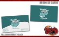
We have been working with a start up company called Kombi Ice Cream to print vehicle graphics, business cards, menus, and so on. Check out the business cards. They will be selling ice cream from a very cool restored VW bus. They attend VW related car shows around the country. The set up they are putting together should be a big hit around the car shows they attend.

I will be adding to the post on my site as we complete more of the work this week.

Website Removed.
"You are more than welcome to attach Pictures of your progress.
But please do not post and direct people to your website."
 

Attachments

  • kombiicream_businesscards.jpg
    kombiicream_businesscards.jpg
    39.4 KB · Views: 135
Last edited by a moderator:

Pat Whatley

New Member
I don't know...separating ICE & CREAM like that really throws me off. The distance and the clashing letter styles really makes it hard to follow.
 

signmeup

New Member
I really like it visually. But it reads "Komb Ice" while the company name is "Kombi Ice Cream". Combining the "I" just doesn't work.
 

Salmoneye

New Member
I agree about the brush script and the reading like Komb Ice. The two tone card however is very appealing. I think with a couple of tiny changes it will look great.
 
S

scarface

Guest
I didn't even notice the brush script either it was put together so well.

Good job Dan!
 

FatCat

New Member
I agree with the comments about too much separation between ice and cream - otherwise clean layout and good colors.
 

Jillbeans

New Member
It reads really awkwardly, and the font choices are all weak.
Nothing about this says "ice cream" to me, even the name.
I thought it was for a van restorer company.
It would be a nice card for that. Except for the fonts.
Love....Jill
 

HeavyHitter

New Member
It reads really awkwardly, and the font choices are all weak.
Nothing about this says "ice cream" to me, even the name.
I thought it was for a van restorer company.
It would be a nice card for that. Except for the fonts.
Love....Jill

Thanks to all for replying. The logo design was something the customer supplied. While I agree with you guys and gals on the ice and cream issue that is what I was given to work with. It could not be changed because the customer has already went through the trademarking process. I guess you can say I was stuck on making suggestions there.


Dan
 

artsnletters

New Member
all of the above...bad font...bad use of space....separation of ICE & CREAM....too small on a card. It doesn't scream ICE CREAM...which it should. Main focus should be that...explain to the customer the issues, they will be better off in the long run, a successful logo for a upstart business is like air-you just need it.
Tim
 

Flame

New Member
First 3 things I noticed (in order)


1. Shag'n Wagon

2. Ice???? oh wait, yeah, it's ice cream.

3. Um... Brush Script?


General idea is nice, I know you are capable of sick work man... but those 3 things bugged me.
 

mark galoob

New Member
just because you have thousands of dollars of design equipment, and bizillions of hrs of design time, does not mean you have to use it. this card is very simple, and elegant, and THAT is all it needs...sometimes it seems like some of the folks here on this forum expect every piece of art to be extremly graphic and detailed with lots of stuff in it. why? if you cant see the beauty of the silence in this very simple and elegant card i wonder if you are too fixated on your design programs instead of the actual design itself.

ive been a drummer and a drum teacher for about 30 yrs. ive never been the loudest or fasted drummer around, but people come to me to learn to drum because of the way i use the silent notes. the rest (silent) notes are what creates the rythm, not the other way around.

mark galoob
 
Top