-
I want to thank all the members that have upgraded your accounts. I truly appreciate your support of the site monetarily. Supporting the site keeps this site up and running as a lot of work daily goes on behind the scenes. Click to Support Signs101 ...
You are using an out of date browser. It may not display this or other websites correctly.
You should upgrade or use an alternative browser.
You should upgrade or use an alternative browser.
I've run out of gas on this one
- Thread starter SignosaurusRex
- Start date
Sticky Signs
New Member
I like #2 much better but I keep asking myself, where is the red? If it was any other name I'd say leave it because it's great. My 0.02$
signmeup
New Member
I never said the freakin wolves were too red.... I said they were pink.Don't change a thing, you nailed it. Signmeup will say the wolves at the top are still too red, but I like it.:Big Laugh

Pay attention man.

daveb
General Know-it-all
That.... and the "red" wolves are pink.
:Oops:Sorry, my bad....I never said the freakin wolves were too red.... I said they were pink.
Pay attention man.

SignosaurusRex
Active Member
what font is the Red Wolves? I like it
A soon to be released A&S font called "Tuscano Script".
In fairness, we still don't know what it's for or where it's going but, to me, it looks like a sign for a Victorian house of ill repute. It is pretty though.
Sorry .....Beer label for starters.
SignosaurusRex
Active Member
what if you made "Red Wolves" larger....i love the colors and label, i think it would look great on a bottle, but the name needs to stick out better....
Surely you jest!

Deaton Design
New Member
Very nice layout on the last one. Everything looks good imo.
TheSellOut
New Member
SignManiac
New Member
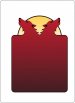
I don't have that really nice font you used, so I substituted another one. I think having the two head logo on your background distracts from the lettering and it's redundant since you have it up top.
Here's my take on what you have which is a great start. I'm jealous you get to beta those nice new fonts")
Here's my take on what you have which is a great start. I'm jealous you get to beta those nice new fonts
Attachments

SignosaurusRex
Active Member
I don't have that really nice font you used, so I substituted another one. I think having the two head logo on your background distracts from the lettering and it's redundant since you have it up top.
Here's my take on what you have which is a great start. I'm jealous you get to beta those nice new fonts
Thanks for the input. The background will definitely need to change with each flavor/style of brew.
J Hill Designs
New Member
coming along sweet, just wondering if it needs to be 9% alcohol by volume?
OutlawsLimited
New Member
The first two look good, but would personally take SignManiacs' Rendition of it. Maniacs appears less busy and easy to pick up at a glance to the eye, while still holding a eye catching theme.
Surely you jest!
Sorry, did my opinion offend you?
SignosaurusRex
Active Member
Sorry, did my opinion offend you?
Nope