MotorCityMan
New Member
never mind
Last edited:
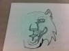
I'd scratch the tiger itself look. Personally, I don't think you drew them, therefore.... you're probably committing copyright infringements.
Is there a reason you think you need a picture ??
That's a rude assumption, and yes I did draw them. Why do you feel the need to attack me personally?
A picture is worth a thousand words.
That's a rude assumption, and yes I did draw them. Why do you feel the need to attack me personally?
A picture is worth a thousand words.
Put a little more space to the right and left of the ampersand.
This second one is the best so far. You might want to keep the same ine copy the same color. It gels better.
Generally changing up colors, means a change in ideas or importance.
Kinda like:MotorCity
MAN
A picture is worth a thousand words.
")