• I want to thank all the members that have upgraded your accounts. I truly appreciate your support of the site monetarily. Supporting the site keeps this site up and running as a lot of work daily goes on behind the scenes. Click to Support Signs101 ...

Logo Design Help

rjpjr

New Member
the AT&T logo is a long established logotype that has gone through many transitions in the last 120 plus years, starting out with the BELL logo, which was directly associated with the bell on early telephones, do you remember (see attachment)?

:banghead: :doh:... Yea, well, I guess I could have picked a better example. :ROFLMAO:

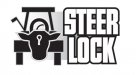
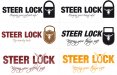
As I read the Original post, the customer suggested the use of a steer. I feel that we should do our best to present at least one concept that fulfills the clients expectations. I remember hearing the old expression, "mess with the bull, get the horn!" With that imagery in mind, I feel that a longhorn can be used effectively to convey security and toughness especially since the customer suggested it. This is one of the few situations where a customer's suggestion might actually work. That being said, I agree that an additional design or concept may be a good idea.

Oh yea...
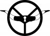
... however, they don't depict a steer head either, or any other animal, mineral, or vegetable,..
 

Attachments

  • Aflac.jpg
    Aflac.jpg
    10.5 KB · Views: 96
  • The-Hartford.jpg
    The-Hartford.jpg
    33.1 KB · Views: 108

sthammar

New Member
the lock

Lots of good advices in here...

My tought tough is.

- Its a lock that locks golf carts

- the "brand name" is steer.

- The client wants a steer head in the logo.

Ok that all good.. but i must agree on the fact that a big steer head is making me think of cattle not strenght.

How about making the main thing a LOCK and letting the lock be the dominating part, and the second thing a steer head?

That way you can satisfy the fact that it is a new item on the market and it is a lock ( not a "bull") If the company then branches out with there locks they can.

If you put in a golfcart in the logo you kind of "lock" :ROFLMAO: it to golf carts.

My 5 cents to the subject.

Ps sorry if my spelling aint correct....
 

Deaton Design

New Member
I used Philips steer head on this, and put a golf cart in behind.
Just a quick idea.
 

Attachments

  • steerlock.jpg
    steerlock.jpg
    20 KB · Views: 83

sthammar

New Member
Some quick mockups of ideas i put together while making some backups of my files. Don't know if you allready have decided and made the logo... but here they are...

I know i am a bad english speller so please don´t bash me if there is anything misspelled....:frustrated:

hmm well i hope i am doing this correctly so the images is uploaded....
 

Attachments

  • steerlocks_mockups.jpg
    steerlocks_mockups.jpg
    238.7 KB · Views: 117
  • steerlocks_mockups.pdf
    128.8 KB · Views: 146
Building off of signmaniacs mockups... I saw the padlock and it reminded me of a cowbell. How about trying somethings with that concept rather than the obvious cow head.
 
Top